Blocks
Kirby ships with a number of default blocks, but the blocks field really shines when you start adding your own custom blocks.
The default preview for custom blocks is nice, but it can be even better! You can create your own Vue component to render previews for your blocks directly in the blocks editor. You can even make them editable. Or you take it beyond previews and add the frontend HTML output for your block as well. We will look into these different ways of extending Kirby with custom blocks.
A pretty extensive crash course in how to create a block preview plugin.

Static preview
The easiest way to get started with block previews is a Vue component that only generates a bit of HTML for the block.
Let's use a custom call to action button block as example for this plugin guide:
fields:
  blocks:
    type: blocks
    fieldsets:
      - heading
      - text
      - type: button
        name: Button
        icon: bolt
        fields:
          link:
            type: url
          text:
            type: text
By default, such custom blocks will all use a generic block preview including the defined icon and the name of the block.

To get started, create a new folder called /site/plugins/button and add an index.php, index.css and an index.js
index.php
For starters, the index.php file will do nothing but tell Kirby that the plugin exists. Later, we will add a default blueprint and snippet for the block, but we skip this for the moment.
<?php

Kirby::plugin('your-project/button-block', []);
index.js
The index.js file is the place to register your Vue component for the Panel and create the template for your block. You can write it in simple vanilla JS, or you can go for a full-blown setup with build process to work with Vue single-file-components. We keep it simple for this example.
panel.plugin("your-project/button-block", {
  blocks: {
    button: `
      <button type="button" @click="open">
        {{ content.text }}
      </button>
    `
  }
});
In its most basic form, the button block is just an HTML template string that renders the block preview.
As you can see in the template above, there are a few things that don't look like vanilla JS and come from Vue.
With @click="open" we react to the click event of the button and call the open method that every block has. This open method will open the block drawer with the form fields you defined in the blueprint for the block.
Every block also has access to a content object with all the values of your fields. With {{ content.text }} we can render the value of the text field for the button. {{ content.link }} would print the URL.
index.css
We can finally polish our preview with a little bit of CSS.
.k-block-type-button button {
    border: 2px solid #000;
    display: inline-flex;
    border-radius: 3rem;
    padding: .25rem 1.5rem;
    cursor: pointer;
}
.k-block-type-button button:empty::after {
    content: "Button text …";
    color: var(--color-text-light);
}
.k-block-type-button button:focus {
    outline: 0;
    border-color: var(--color-focus);
}
Every block in the Panel has a default class name that reflects the block type (i.e. k-block-type-button, k-block-type-heading) for easy styling. For more control, add additional class names to elements inside your previews.
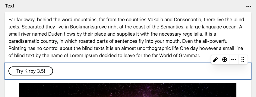
The final result
Instead of the generic preview, we will now see a much more visual representation of the button we created. Add your own styles to adapt the button to your design.
Preview with WYSIWYG editing
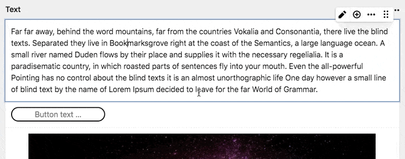
The button preview in the example above is static and will only change when you open the block drawer and start editing the fields.
If you want to go one step further, you can turn your button block into a tiny WYSIWYG editor with just a bit more work. Examples for such WYSIWYG editing blocks are our text, heading, quote or code blocks.
Extending your index.js
panel.plugin("your-project/button-block", {
  blocks: {
    button: `
      <input
        type="text"
        placeholder="Button text …"
        :value="content.text"
        @input="update({ text: $event.target.value })"
      />
    `
  }
});
See the magic happen …
Let's talk about the code a bit more. We use a regular HTML text input and put a little bit of Vue.js magic on top of it.
With :value="content.text" we can feed the value from the text field into our input. The : is Vue's syntax for passing non-string attribute values.
We listen to the input event of the input field by using Vue's @input event listener syntax.
Our block components have an update method, which we can use to tell the Blocks field that the block content has changed. The update method will merge the content object with whatever we pass as an argument.
With { text: 'Something' } we can only update the text field of the block. With $event.target.value, we fetch the current value of the input field whenever the value changes.
The Blocks field will take care of the rest.
Full Vue component
When your preview gets more complex, you probably need computed values or methods that are normally available in Vue components. The examples above just focused on the template code, but you can extend this to a full Vue component:
panel.plugin("your-project/button-block", {
  blocks: {
    button: {
      computed: {
        placeholder() {
          return "Button text …";
        }
      },
      template: `
        <input
          type="text"
          :placeholder="placeholder"
          :value="content.text"
          @input="update({ text: $event.target.value })"
        />
      `
    }
  }
});
Adjusting the index.css
To wrap this up, we need to adjust our CSS file a bit to make it work with the input element instead of the button.
.k-block-type-button input {
    border: 2px solid #000;
    border-radius: 3rem;
    padding: .25rem .75rem;
    cursor: pointer;
    font: inherit;
    text-align: center;
}
.k-block-type-button input:focus {
    outline: 0;
    border-color: var(--color-focus);
}
Single file components
All examples above are written in plain JS. You don't need a build process to create such preview plugins. But if you want to go further and use Vue's brilliant single file components, you need to look into our pluginkit for Panel plugins that comes with a full build process and parses Vue single file components. You can then switch the example above to a single file component in no time:
<template>
  <input
    type="text"
    :placeholder="placeholder"
    :value="content.text"
    @input="update({ text: $event.target.value })"
  />
</template>

<script>
export default {
  computed: {
    placeholder() {
      return "Button text …";
    }
  }
};
</script>

<style>
.k-block-type-button input {
    border: 2px solid #000;
    border-radius: 3rem;
    padding: .25rem .75rem;
    cursor: pointer;
    font: inherit;
    text-align: center;
}
.k-block-type-button input:focus {
    outline: 0;
    border-color: var(--color-focus);
}
</style>import Button from "./components/Button.vue";
panel.plugin("your-project/button-block", {
blocks: {
button: Button
}
});When using single file components, you store your CSS directly with the component. You can get rid of the index.css in that case.
Quick and easy: Fields preview
Sometimes, you don't want to add a fully customised preview for a block, but would like the block to show more than just the headline in the list of blocks.
For this you can use the built-in preview: fields option (either with or without wysiwyg: true) which will show the blocks fields right in the preview. No need to open the drawer anymore, it even supports showing tabs.
fields:
  blocks:
    type: blocks
    fieldsets:
      - type: button
        wysiwyg: true
        preview: fields
        tabs:
          main:
            label: Main
            fields:
              label:
                type: text
              color:
                type: color
              url:
                type: url
          settings:
            label: Settings
            fields:
              target:
                type: text
              class:
                type: text
Full block plugins
We now created a preview plugin for a custom block that we defined in our blueprints. We can extend our plugin to include the blueprint definition and snippet to share as stand-alone blocks with other projects or Kirby users.
Adding a default blueprint and snippet
As a first step, register the custom snippet and blueprint in the index.php of your plugin:
<?php

Kirby::plugin('your-project/button-block', [
  'blueprints' => [
    'blocks/button' => __DIR__ . '/blueprints/blocks/button.yml'
  ],
  'snippets' => [
    'blocks/button' => __DIR__ . '/snippets/blocks/button.php'
  ]
]);
Then, add the blueprint definition and the snippet code in their respective files:
Blueprint
name: Button
icon: bolt
fields:
  link:
    type: url
  text:
    type: text
Snippet
<a class="btn" href="<?= $block->link()->toUrl() ?>">
  <?= $block->text()->html() ?>
</a>