Blocks
A visual editor for long-form text and modular pages
The Blocks field is the perfect solution for complex single-column layouts and long-form text.

Blueprint setup
You can add the Blocks field to any fields section in your Panel like this:
fields:
  text:
    type: blocks
Field properties
| Property | Type | Default | Description |
|---|---|---|---|
| autofocus | bool |
- | Sets the focus on this field when the form loads. Only the first field with this property gets focus. |
| default | array |
- | Default value for the field, which will be used when a page/file/user is created |
| disabled | bool |
- | If true, the field is no longer editable and will not be saved |
| empty | string |
- | Customize the default text when the blocks field is empty |
| fieldsets | array |
- | Defines the allowed block types in the blocks field. See below. |
| help | - | Optional help text below the field | |
| label | - | The field label can be set as string or associative array with translations | |
| max | int |
- | Maximum number of allowed blocks |
| min | int |
- | Minimum number of required blocks |
| pretty | bool |
false |
Saves pretty printed JSON in text files |
| required | bool |
false |
If true, the field has to be filled in correctly to be saved. |
| translate | bool |
true |
If false, the field will be disabled in non-default languages and cannot be translated. This is only relevant in multi-language setups. |
| when | - | Conditions when the field will be shown | |
| width | string |
1/1 |
The width of the field in the field grid. Available widths: 1/1, 1/2, 1/3, 1/4, 2/3, 3/4 |
Defining Fieldsets
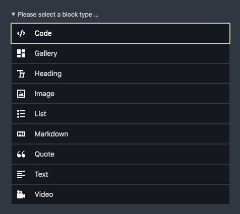
By default, the block selector shows a single list of available block types in alphabetical order.
fields:
  text:
    type: blocks
However, you can fully customize the selector for new block types with sorted block types and groups.
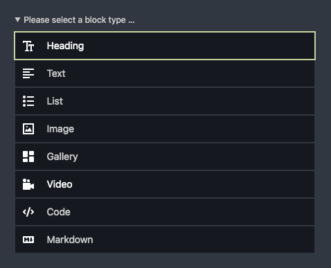
To change the order of available blocks, list them manually with the fieldsets option:
fields:
  text:
    type: blocks
    fieldsets:
      - heading
      - text
      - list
      - image
      - gallery
      - video
      - code
      - markdown
Groups
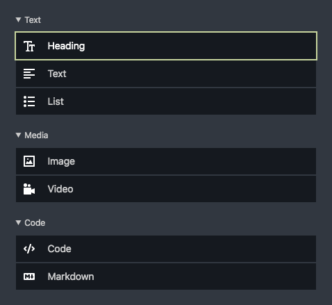
You can group block types in the block selector for a better overview of the available options. This is particularly useful when your blocks lists gets longer once your start creating your own custom blocks.
To create such groups, use the Blocks field's generic "group" block type:
fields:
  text:
    type: blocks
    fieldsets:
      text:
        label: Text
        type: group
        fieldsets:
          - heading
          - text
          - list
      media:
        label: Media
        type: group
        fieldsets:
          - image
          - video
      code:
        label: Code
        type: group
        fieldsets:
          - code
          - markdown
Closed groups
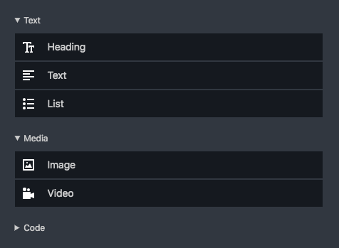
By default, all groups are open. With very long list, you might want to close groups of blocks that are used less frequently with the open: false option:
fields:
  text:
    type: blocks
    fieldsets:
      text:
        label: Text
        type: group
        fieldsets:
          - heading
          - text
          - list
      media:
        label: Media
        type: group
        fieldsets:
          - image
          - video
      code:
        label: Code
        type: group
        open: false
        fieldsets:
          - code
          - markdown
Default values
You can set default blocks/values for blocks fields which will prepopulate the field using the default prop. The type property is required, but default blocks can be empty or filled with example content.
Empty default block
fields:
  text:
    type: blocks
    default:
      - type: text
Default block with content
fields:
  text:
    type: blocks
    default:
      - type: text
        content:
          text: Write something great…
Multiple block types
You can also set multiple default block entries:
fields:
  text:
    type: blocks
    default:
      - type: heading
        content:
          level: h2
          text: A heading
      - type: text
        content:
          text: Write something great…
Block types
Custom block types
Kirby's built-in blocktypes are not enough? Create your own! Check out our extensive documentation on custom block types, from basic to advanced:
- Custom blocks
- Custom block types
- Audio block with preview
- Block factory: Creating your own blocks collection
- Nested blocks
Block preview type fields
Instead of manually creating previews for blocks types, you can use the fields preview type to display the fields together with their content.
fields:
  blocks:
    type: blocks
    fieldsets:
      demo:
        wysiwyg: true
        preview: fields
        tabs:
          main:
            fields:
              title:
                type: text
              subtitle:
                type: text
              description:
                type: writer
          settings:
            label: Settings
            fields: # ...
Extending core blocks
From modifying the output to how they are previewed in the Panel, you can also overwrite Kirby's built-in block types:
Blocks in your templates
If you don't want to care about the HTML for each individual block, you can echo the entire blocks collection to render all blocks.
<?= $page->myBlocksField()->toBlocks() ?>Looping through blocks
Looping through blocks to control their HTML can be very powerful. You can assign custom CSS classes, IDs for links and more.
You don't need to render the HTML for each individual block in the loop though. You can wrap the block with your custom HTML and then echo the $block object to render the matching block snippet.
<?php foreach ($page->myBlocksField()->toBlocks() as $block): ?>
<div id="<?= $block->id() ?>" class="block block-type-<?= $block->type() ?>">
  <?= $block ?>
</div>
<?php endforeach ?>
Manually loading snippets
Sometimes you might wish to customize the way block snippets are loaded. Maybe you want to inject more snippet variables.
<?php foreach ($page->myBlocksField()->toBlocks() as $block): ?>
<div id="<?= $block->id() ?>" class="block block-type-<?= $block->type() ?>">
  <?php snippet('blocks/' . $block->type(), [
    'block' => $block,
    'theme' => 'dark'
  ]) ?>
</div>
<?php endforeach ?>
… or load snippets from a different location …
<?php foreach ($page->myBlocksField()->toBlocks() as $block): ?>
<div id="<?= $block->id() ?>" class="block block-type-<?= $block->type() ?>">
  <?php snippet('blocks/custom/' . $block->type(), [
    'block' => $block,
    'theme' => 'dark'
  ]) ?>
</div>
<?php endforeach ?>
Configuration
You can configure the default setup of your Blocks field in your config.php
<?php

return [
  'blocks' => [
    'fieldsets' => [
      'text' => [
        'label' => 'Text',
        'type' => 'group',
        'fieldsets' => [
          'text',
          'heading'
        ]
      ],
      'media' => [
        'label' => 'Media',
        'type' => 'group',
        'fieldsets' => [
          'image',
          'video'
        ]
      ]
    ]
  ]
];