Info
A plain HTML field for user instructions
The info field is a great way to provide inline help or information for your users. You can put any kind of text in this field and it will be displayed as plain text. For better formatting you can use Markdown and KirbyText.

Example
fields:
  info:
    label: Info
    type: info
    text: |
      Dear editor,

      each project should have a **cover.jpg**, which will be displayed in the project overview. You should also make sure to fill in all fields correctly.

      In love,
      Your admin
Field properties
| Name | Type | Default | Description |
|---|---|---|---|
| help | mixed |
null
|
Optional help text below the field |
| icon | string |
null
|
Optional icon that will be shown at the end of the field |
| label | mixed |
null
|
The field label can be set as string or associative array with translations |
| text | mixed |
null
|
Text to be displayed |
| theme | string |
null
|
Change the design of the info box |
| when | mixed |
null
|
Conditions when the field will be shown (since 3.1.0) |
| width | string |
'1/1'
|
The width of the field in the field grid, e.g. 1/1, 1/2, 1/3, 1/4, 2/3, 3/4 |
Using KirbyText
In addition to markdown, you can use KirbyText in your info text, even including images:
info:
  text: "Check out the (link: help text: help pages) for details"
Themes
The info field is displayed as a blue info box. You can switch the theme with the theme option, to match the importance or meaning of the information.
Available themes
info(default)positivenegativenoticewarningpassivetextdarkcodeempty
fields:
  info:
    label: Info
    type: info
    theme: negative
    text: This is a very important page type. Please double-check your content before publishing.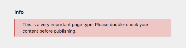
Disable theming
You can disable the infobox theme entirely to show neutral text.
fields:
  info:
    label: Info
    type: info
    theme: none
    text: This is a very neutral message.