Custom blocks
Custom blocks

You create custom block types from the same three components (blueprint, snippet, option preview) as described in the previous chapter.
If you don't need a flashy visual preview, you can make do with only a blueprint and a snippet. Learn how to create your own custom block types with our extensive documentation.
Define custom block in fieldsets
The most simple way to add a custom block is to define it right in the fieldsets list of your blocks field definition. This is great if your custom block is simple and you only need it in this one place.
If your custom block type is more complex or you want to use it in multiple places, it's better to create it in a separate file or even a plugin, but we will get to this later. So let's start simple.
fields:
blocks:
type: blocks
fieldsets:
- heading
- text
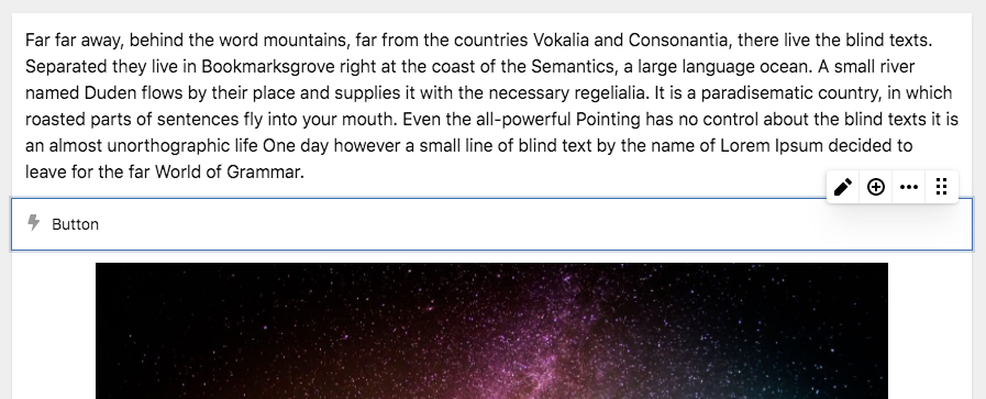
- type: button
name: Button
icon: bolt
fields:
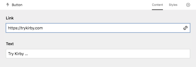
link:
type: url
text:
type: textIn the example above, we mix the default block types (heading and text) with our own custom block type to add a call to action button.
Block type properties
Preview
Custom block types don't have a visual preview by default. They show up with the icon and the name from your blueprint definition.
Field preview
You can set the preview property to fields to allow inline editing of all defined fields without opening the drawer:
fields:
  blocks:
    type: blocks
    fieldsets:
      - heading
      - text
      - type: button
        name: Button
        preview: fields
        wysiwyg: true
        icon: bolt
        fields:
          link:
            type: url
          text:
            type: text
Make sure to also set wysiwyg: true, so that the field are editable.
Label
Custom block types can use the label property to show some information from a field in the block. This can be particularly useful for blocks that don't have a preview:
fields:
  blocks:
    type: blocks
    fieldsets:
      - heading
      - text
      - type: button
        name: Button
        icon: bolt
        label: "{{ text }}"
        fields:
          link:
            type: url
          text:
            type: text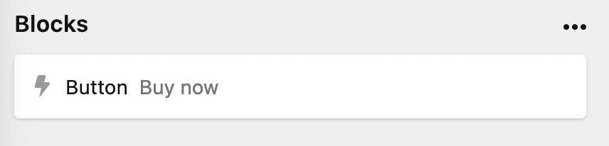
Within the label property, you have access to an array of field properties, here are some more examples:
label: "{{ structure.length }}" # to get the number of items in a structure field

label: "{{ gallery.length }} images" # to get the number of images in a gallery files field

label: "{{ image.0.filename }}" # to get the filename of the first image in the image files field
Editing
To edit a custom block type, editors can either double-tap on the block or click on the edit icon in the toolbar. The block drawer opens with the fields you've defined for the block.

Drawer-less blocks
If you don't define any fields, the block won't have a drawer. This can be useful for blocks that don't feature any configuration (e.g. the default line block).
Tabs
You can also define tabs for your blocks when they have a lot of settings:
fields:
  blocks:
    label: Text
    type: blocks
    fieldsets:
      - heading
      - text
      - type: button
        name: Button
        icon: bolt
        tabs:
          content:
            fields:
              link:
                type: url
              text:
                type: text
          styles:
            fields:
              class:
                type: text
              id:
                type: text
The tabs will then show up in the block drawer.
Global block types
For reuse in multiple places, custom block type definitions can be stored in a folder called site/blueprints/blocks. In this case we would store it in /site/blueprints/blocks/button.yml:
# /site/blueprints/blocks/button.yml
name: Button
icon: bolt
tabs:
  content:
    fields:
      link:
        type: url
      text:
        type: text
  styles:
    fields:
      class:
        type: text
      id:
        type: text
Now, we can use it in our fieldsets option for any blocks field.
fields:
  blocks:
    type: blocks
    fieldsets:
      - heading
      - text
      - button
This also works in groups:
fields:
  text:
    type: blocks
    fieldsets:
      text:
        label: Text
        type: group
        fieldsets:
          - heading
          - text
          - list
          - button
      media:
        label: Media
        type: group
        fieldsets:
          - image
          - video
      code:
        label: Code
        type: group
        fieldsets:
          - code
          - markdown
Custom block type snippet
To render the HTML for your custom block type in the frontend, create a snippet in /site/snippets/blocks. In this case we create a file called /site/snippets/blocks/button.php
<a href="<?= $block->link() ?>" class="btn">
  <?= $block->text() ?>
</a>
Preview plugins
You can turn your custom blocks into highly visual, interactive representations with a custom block preview plugin.