Color
The color field supports multiple color notations, a color picker, pre-defined colors, custom color names, and transparency.

Field properties
| Name | Type | Default | Description |
|---|---|---|---|
| alpha | bool |
false
|
Whether to allow alpha transparency in the color |
| autofocus | bool |
null
|
Sets the focus on this field when the form loads. Only the first field with this label gets |
| default | mixed |
null
|
Default value for the field, which will be used when a page/file/user is created |
| disabled | bool |
null
|
If true, the field is no longer editable and will not be saved |
| format | string |
'hex'
|
The CSS format (hex, rgb, hsl) to display and store the value |
| help | mixed |
null
|
Optional help text below the field |
| icon | string |
null
|
Optional icon that will be shown at the end of the field |
| label | mixed |
null
|
The field label can be set as string or associative array with translations |
| mode | string |
'picker'
|
Change mode to disable the color picker (input) or to only show the options as toggles |
| options | array |
[ ]
|
List of colors that will be shown as buttons to directly select them |
| placeholder | mixed |
null
|
Optional placeholder value that will be shown when the field is empty |
| required | bool |
null
|
If true, the field has to be filled in correctly to be saved. |
| translate | bool |
true
|
If false, the field will be disabled in non-default languages and cannot be translated. This is only relevant in multi-language setups. |
| when | mixed |
null
|
Conditions when the field will be shown (since 3.1.0) |
| width | string |
'1/1'
|
The width of the field in the field grid, e.g. 1/1, 1/2, 1/3, 1/4, 2/3, 3/4 |
Usage
color:
  type: color
  format: hsl # supports hex (default), rgb, hsl
In templates/snippets
<?= $page->color()->escape('css') ?>Alpha
Use the alpha option (default: false) to activate alpha transparency support:
color:
  type: color
  alpha: true
Modes
With the mode option you control which elements of the color field are available. Possible values:
| Option | Description |
|---|---|
picker |
show everything (default) |
input |
show only the input |
options |
show only options |
Options
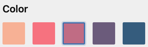
Pre-defined options
Allows adding a list of pre-defined colors that are shown as one-click options in the Panel.
color:
  type: color
  options:
    - "#f8b195"
    - "#f67280"
    - "#c06c84"
    - "#6c5b7b"
    - "#355c7d"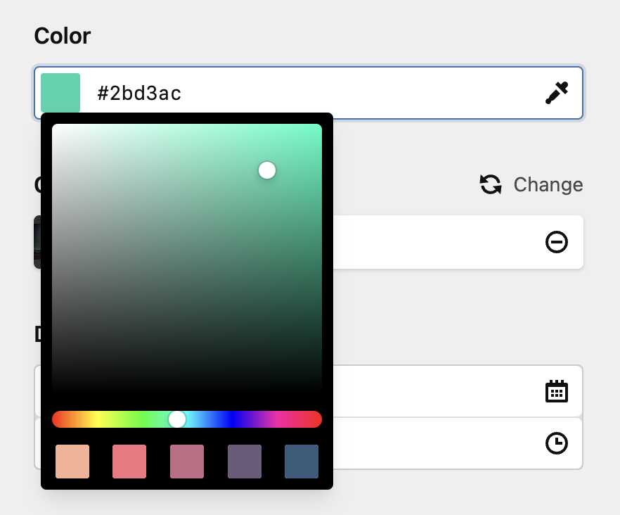
If you name the colors, their name is shown in the Panel as well.
color:
  type: color
  options:
    "#F8B195": "Sunny rays"
    "#F67280": "First-love blush"
    "#C06C84": "Cherry blossom"
    "#6C5B7B": "Morning gloom"
    "#355C7D": "Midnight rain"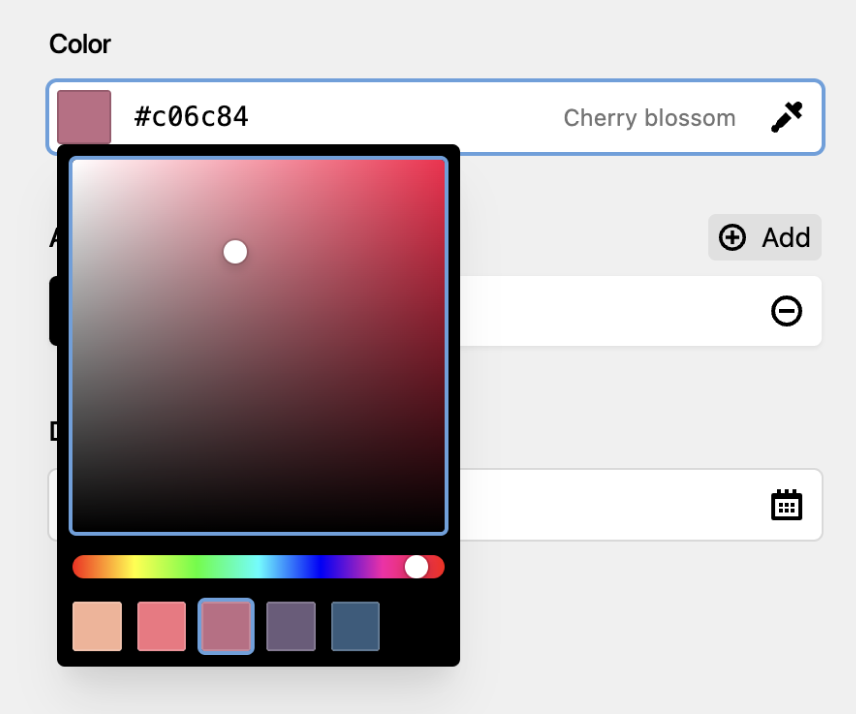
Dynamic options
Our options query syntax offers a powerful way of adding automatically generated option lists to a color field.
myColorField:
  type: color
  options:
    type: query
    query: kirby.option('my.colors')
The example above will get the color options from the my.colors config entry, which could look like:
// only values
return [
    'my' => [
        'colors' => [
            '#3e3e3e',
            '#aaa',
            '#ddd',
        ]
    ]
];

// values -> labels
return [
    'my' => [
        'colors' => [
            '#3e3e3e' => 'Color A',
            '#aaa'    => 'Color B',
            '#ddd'    => 'Color C',
        ]
    ]
];
You can start at the site, current page, users collection, or the kirby instance to run your query.
Custom value and label
To customize the stored value and displayed label, you can be more specific when defining the query: text and value can be defined with the help of our string template language to get exactly what you want as the result.
myColorField:
  type: color
  options:
    type: query
    query: kirby.option('my.colors')
    text: "{{ item.name }}"
value: "{{ item.hex }}"return [
'my' => [
'colors' => [
[
'name' => 'Color A',
'hex' => '#3e3e3e',
],
[
'name' => 'Color B',
'hex' => '#aaa',
],
[
'name' => 'Color C',
'hex' => '#ddd',
]
]
]
];Options via API
If the option queries are not enough or you need to pluck an external source for option data, you can use the API type.
myColorField:
  type: color
  options:
    type: api
    url: https://your-options-api.com/colors.json
By default, the API type expects that the JSON endpoint returns an option array like this:
{
    "#3e3e3e": "Color A",
    "#aaa": "Color B",
    "#ddd": "Color C"
}