New design
Not just some fresh paint
- New menu
- Full-width layout
- A11y improvements
- New button design
- New color scheme
- New icons
- Redesigned save bar
- Better responsiveness
- Refreshed UI components
- New UI plugin options
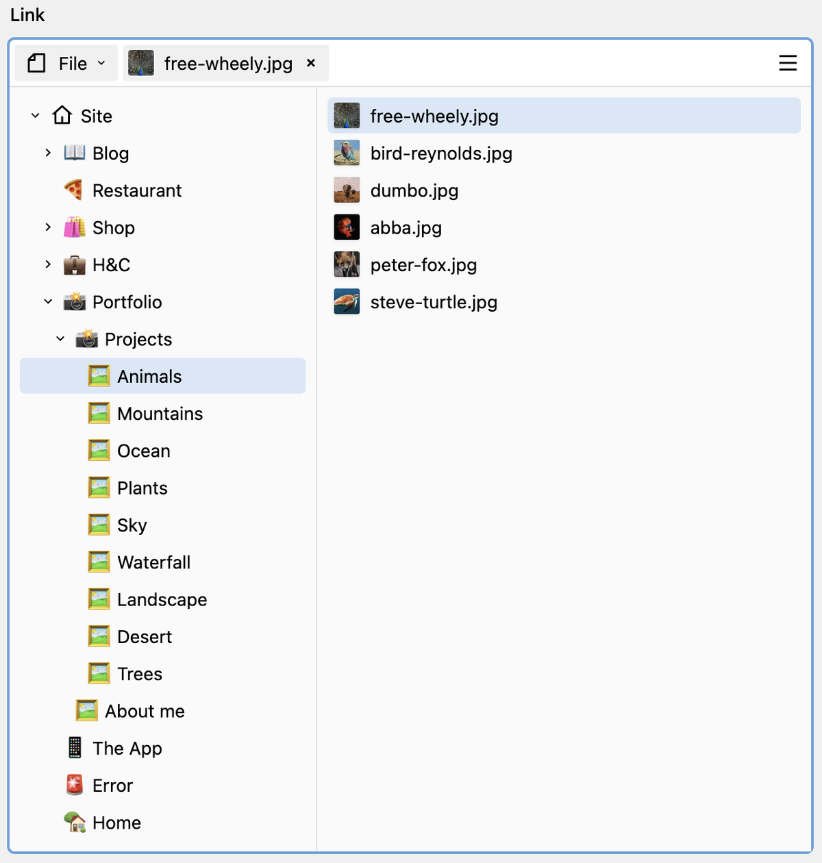
Link field
Link to anything
fields:
  link:
    type: link
Page creation dialogs
Faster, better page creation
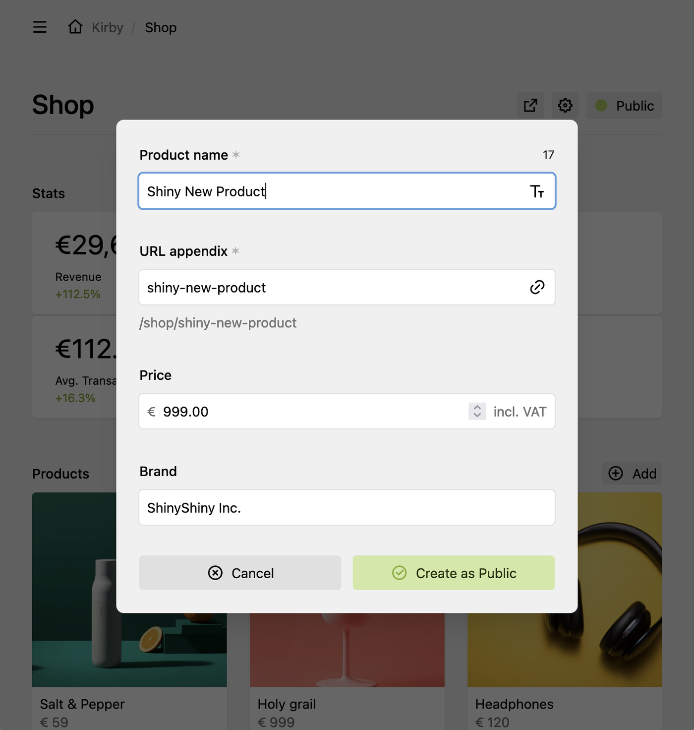
title: Product
create:
title:
label: Product name
fields:
- price
- brand
redirect: false
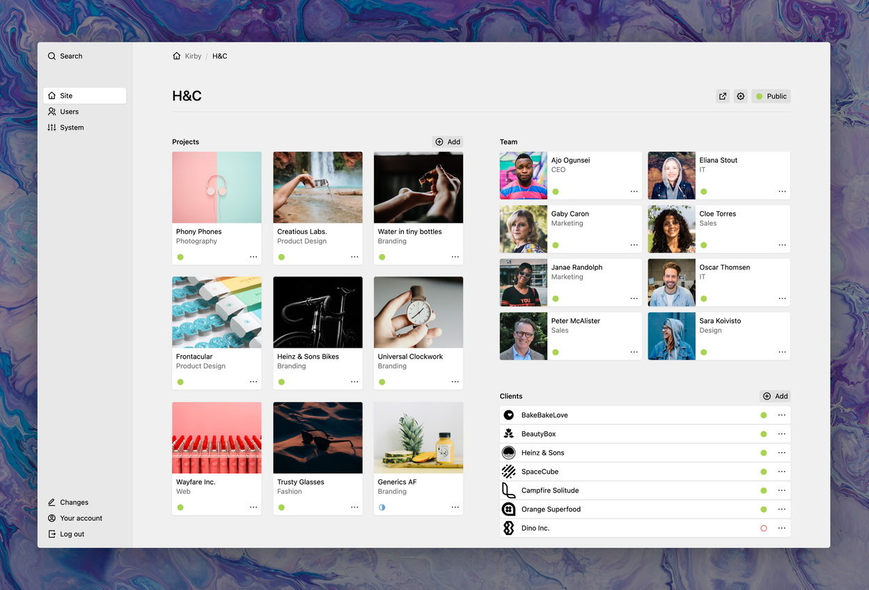
status: listedMoving pages
I like to move it, move it


Section filters
Filter pages and files

Filter pages and files by any criteria: The pages and files sections now come with support for our powerful query string syntax.
expensive:
  extends: sections/products
  label: Expensive
  query: page.childrenAndDrafts.filter('price', '>', '99')
cheap:
  extends: sections/products
  label: Cheap
  query: page.childrenAndDrafts.filter('price', '<=', '99')
Color field
Color me surprised
Color in all its facets: Multiple color notations, color picker, pre-defined colors, custom color names and transparency. You can't get more color than that.

color:
  type: color
  options:
    "Sunny rays": "#F8B195"
    "First-love blush": "#F67280"
    "Cherry blossom": "#C06C84"
    "Morning gloom": "#6C5B7B"
    "Midnight rain": "#355C7D"
Image focus
Focus Pocus
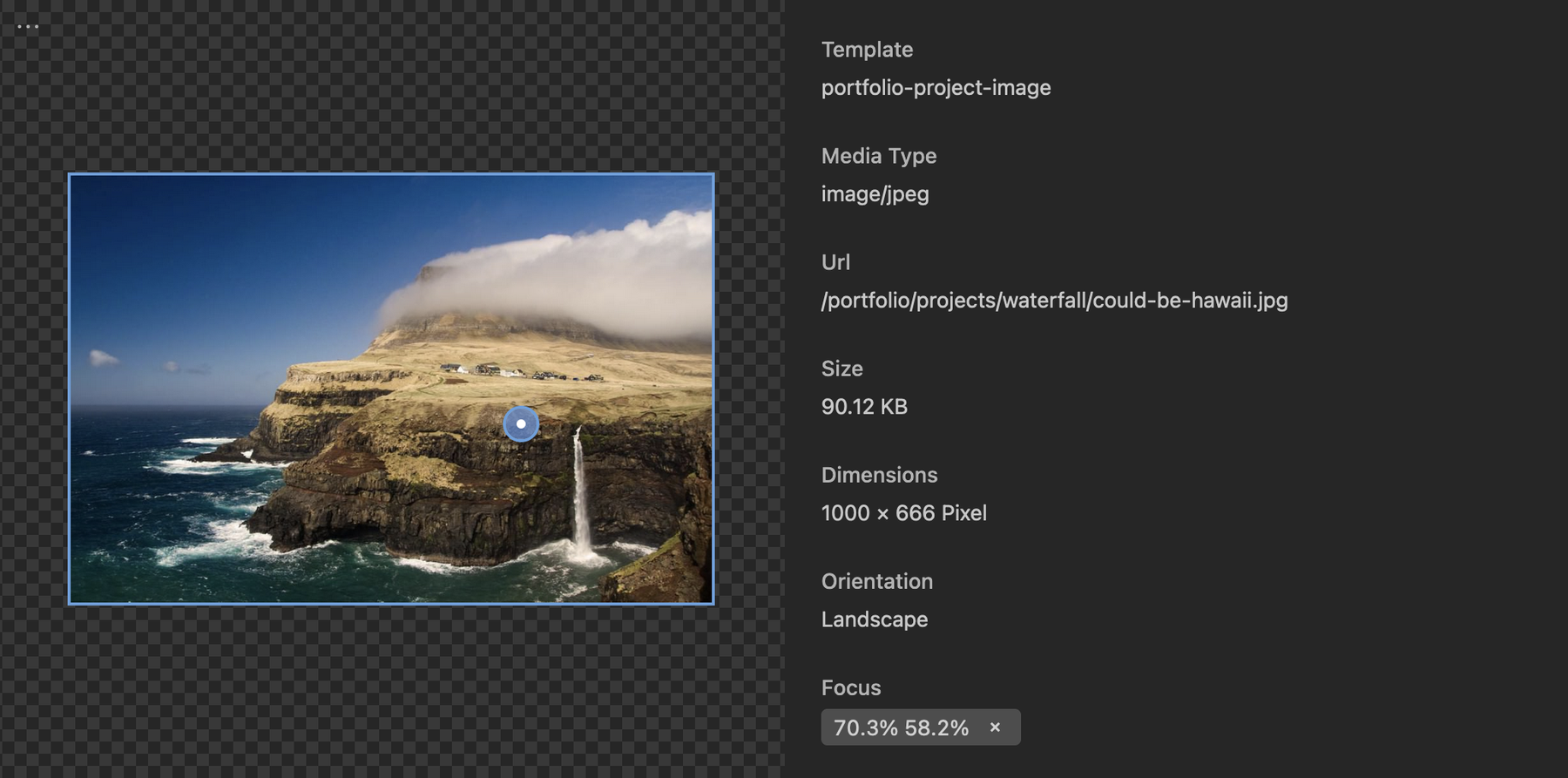
Never cut off the most important part of your images again. Set a focus point and let your images shine in all their beauty.
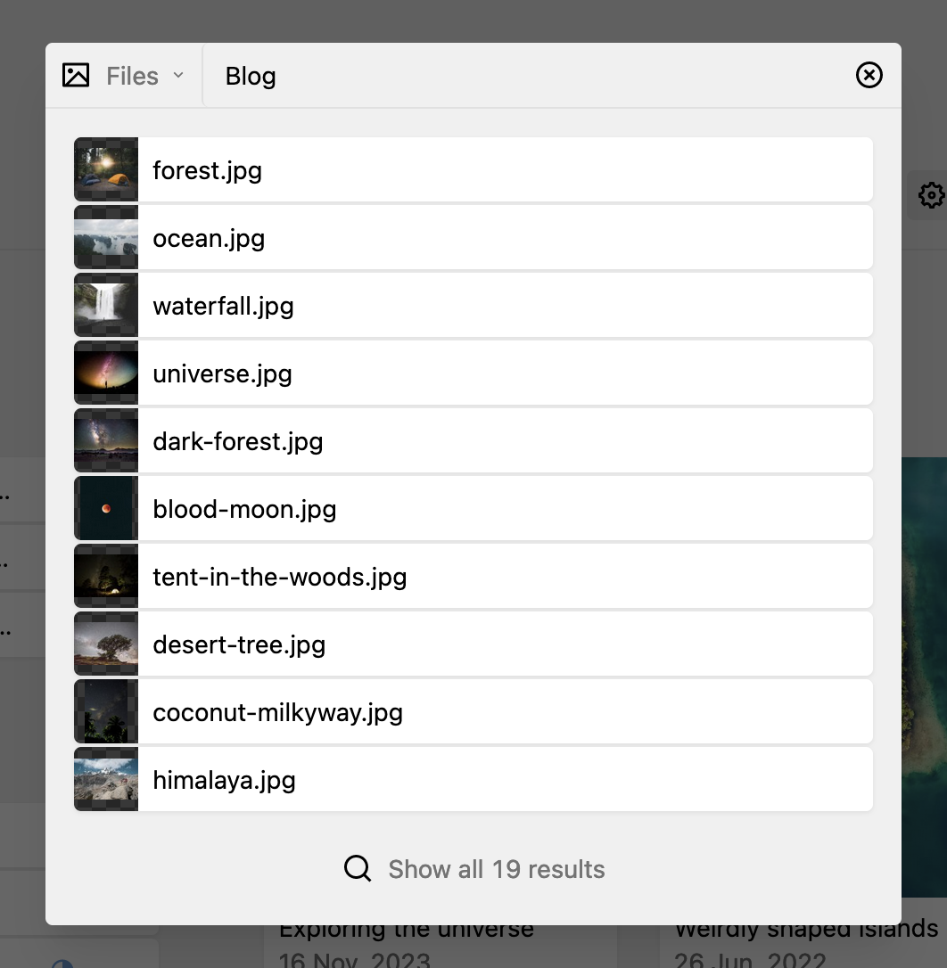
Uploader
Uploading files the smart way

Screenshot-123.jpg? With the preview and edit options in the new upload dialog, meaningless file names are now a thing of the past. Use the new blueprint options to optimize uploads before they land on the server.
title: Image
# Optimize on upload
create:
width: 500
height: 500
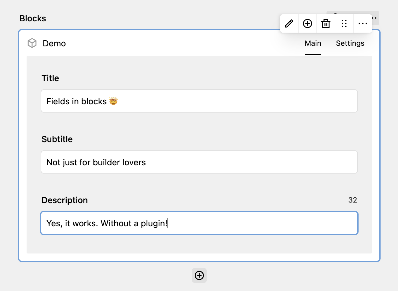
crop: trueBlock field improvements
Our best field is now 25% bester
fields:
blocks:
type: blocks
fieldsets:
demo:
wysiwyg: true
preview: fields
tabs:
main:
fields:
title:
type: text
subtitle:
type: text
description:
type: writer
settings:
label: Settings
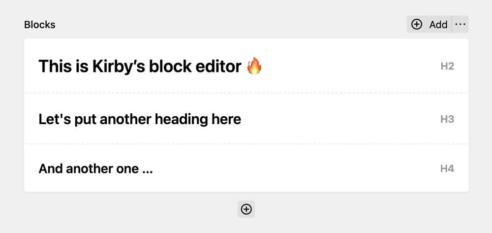
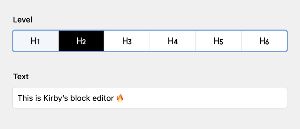
fields: # ...Display and edit headings level inline
New toggles inside the drawer
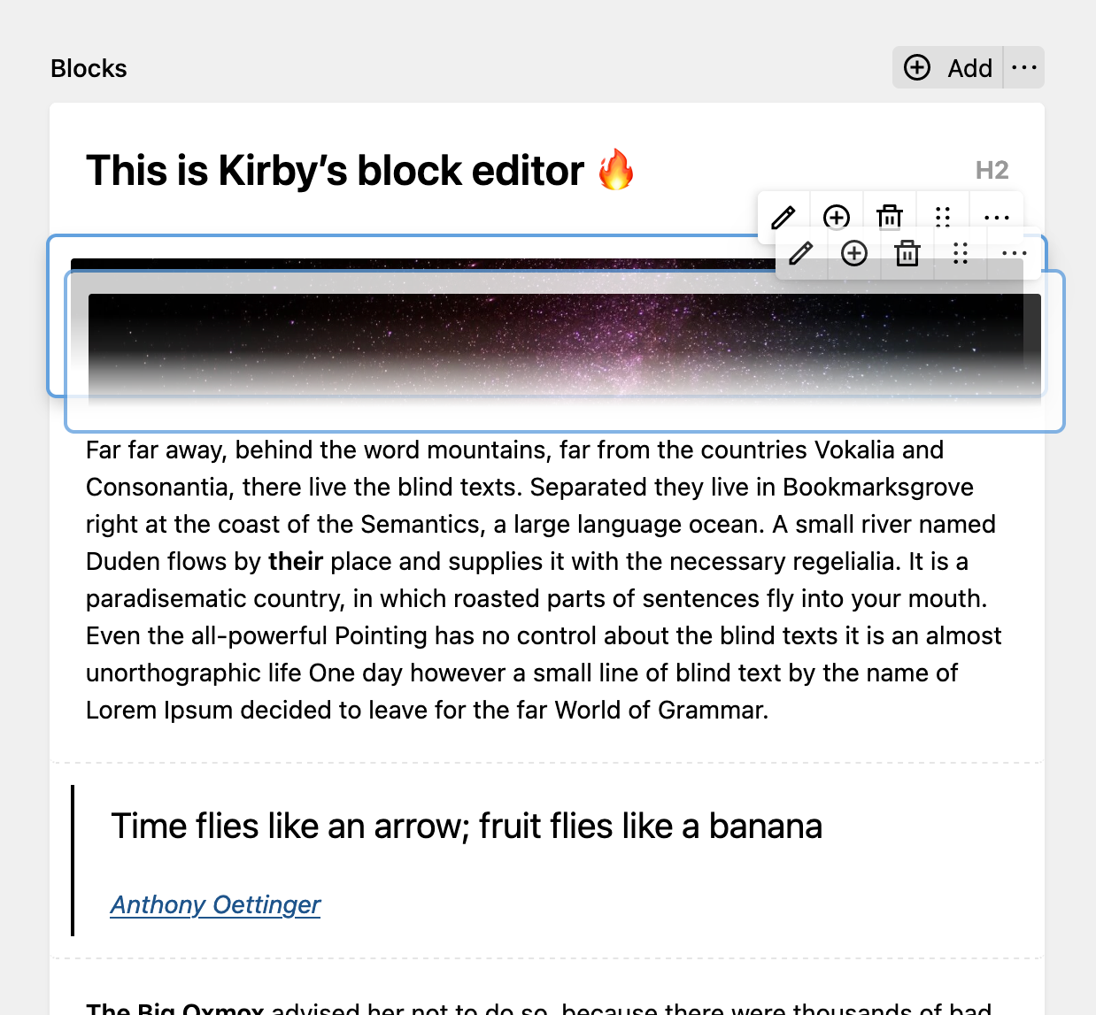
Block splitting
- Split and merge text, list and headings
- New option buttons to split or merge
- Press enter at the end of a headline to append a new text block
- Text block with
inline: truefor text field will split directly on Enter (Shift + Entercreates a hard line break) - Custom blocks can support splitting by implementing a
splitmethod
Minimized blocks while dragging
New Keyboard shortcuts
| Action | Shortcut |
|---|---|
| Remove block | Ctrl + Backspace |
| Move focus up | Ctrl + ↑ |
| Move focus down | Ctrl + ↓ |
| Move block up | Ctrl + Shift + ↑ |
| Move block down | Ctrl + Shift + ↓ |
| Extend selection up | Ctrl + Alt + ↑ |
| Extend selection down | Ctrl + Alt + ↓ |
| Split block | Ctrl + Enter |
| Merge block | Ctrl + J |
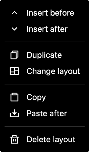
Layout field improvements
Copy & Change
More flexibility: Easily change a layout, and copy one or all layouts into other layout fields.
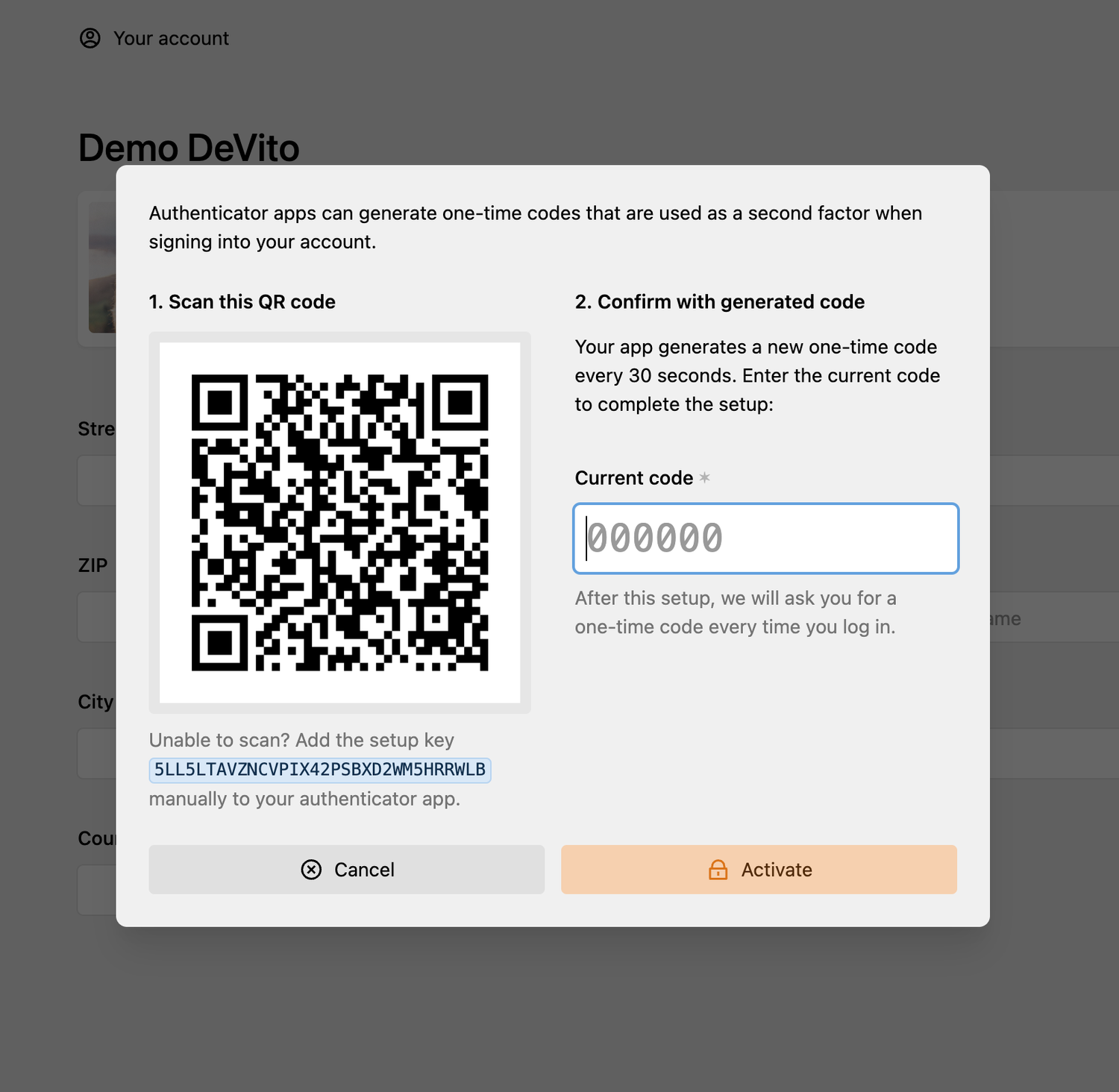
Time-based, one-time passwords
Making your Panel even more secure
Kirby now supports time-based one-time codes (TOTP), offering more secure ways to sign into the Panel. When two-factor authentication is activated, one-time codes from your authenticator app will be used instead of codes via email.
Each user can set up TOTP in the account view in the Panel, adding their secret key to their authenticator app.
return [
    'auth' => [
        'methods' => [
            'password' => ['2fa' => true]
        ]
    ]
];
Language editor
No longer lost in translation
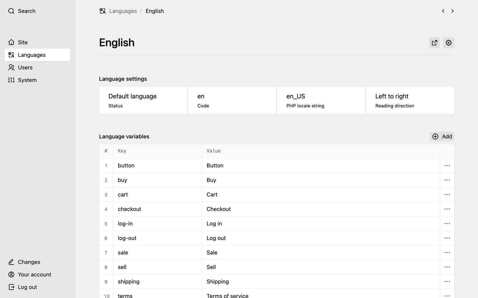
Each language got its own view now. Easily configure your languages or edit language variables right from the Panel. Easy, right?
Search view
Deliver results
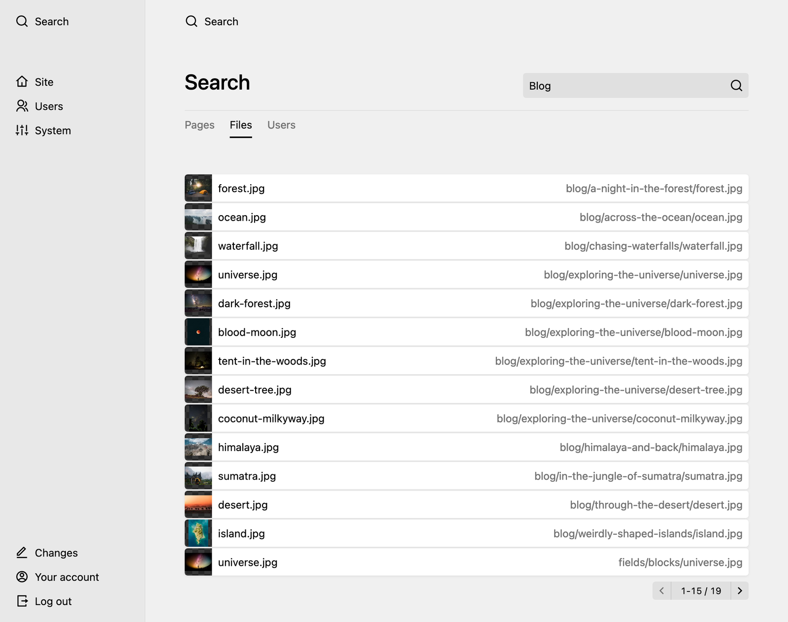
The larger your website, the more important becomes search. With Kirby's new search view, searching in the Panel has become a breeze.
Changeable file templates
Change is in the air
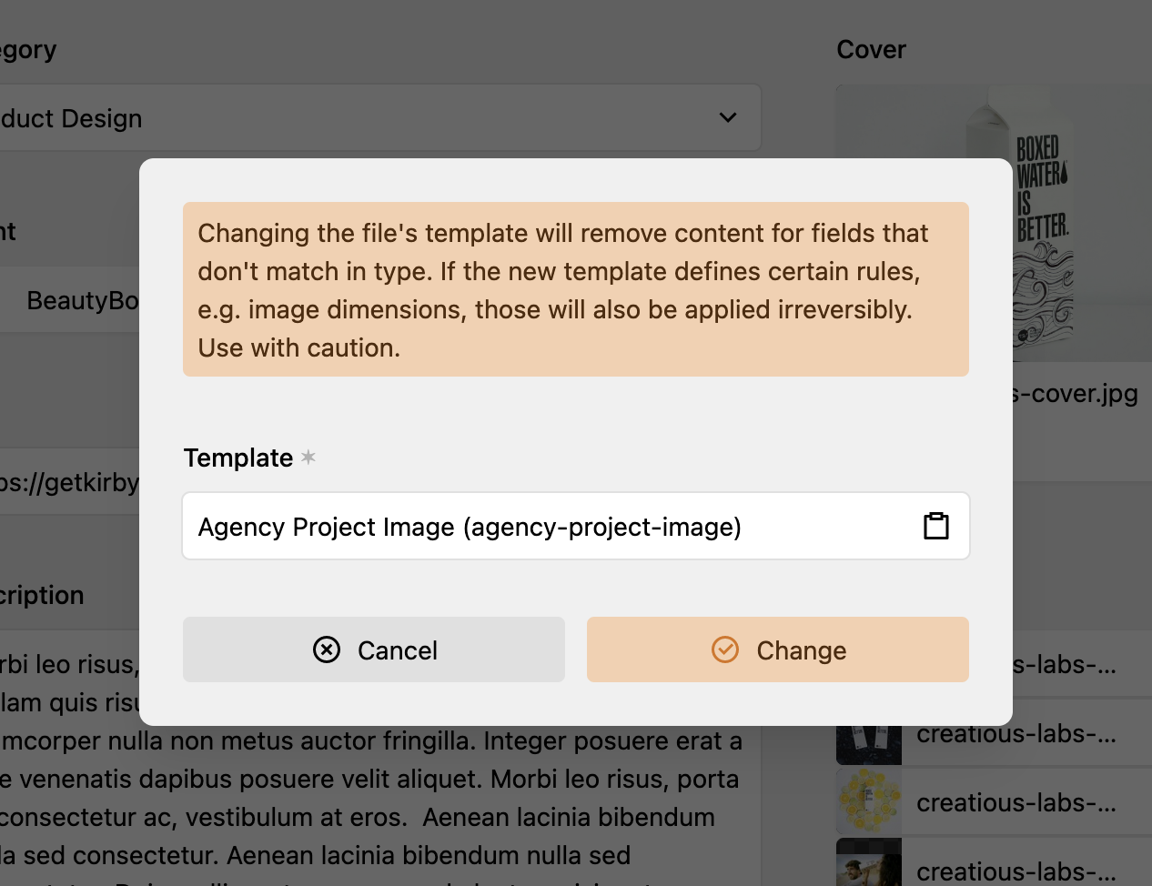
Change file templates to any allowed template defined by its parent in a files section or field.
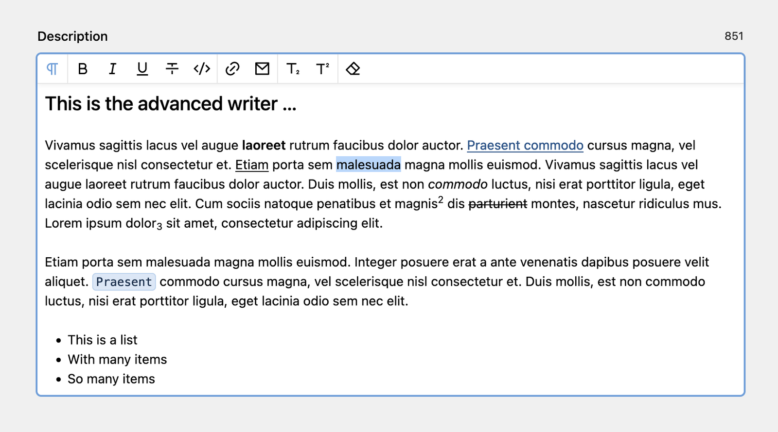
Writer field improvements
Writing in style
With custom marks and nodes for your own style, customizable heading levels and a character counter, you have full control about your writing.
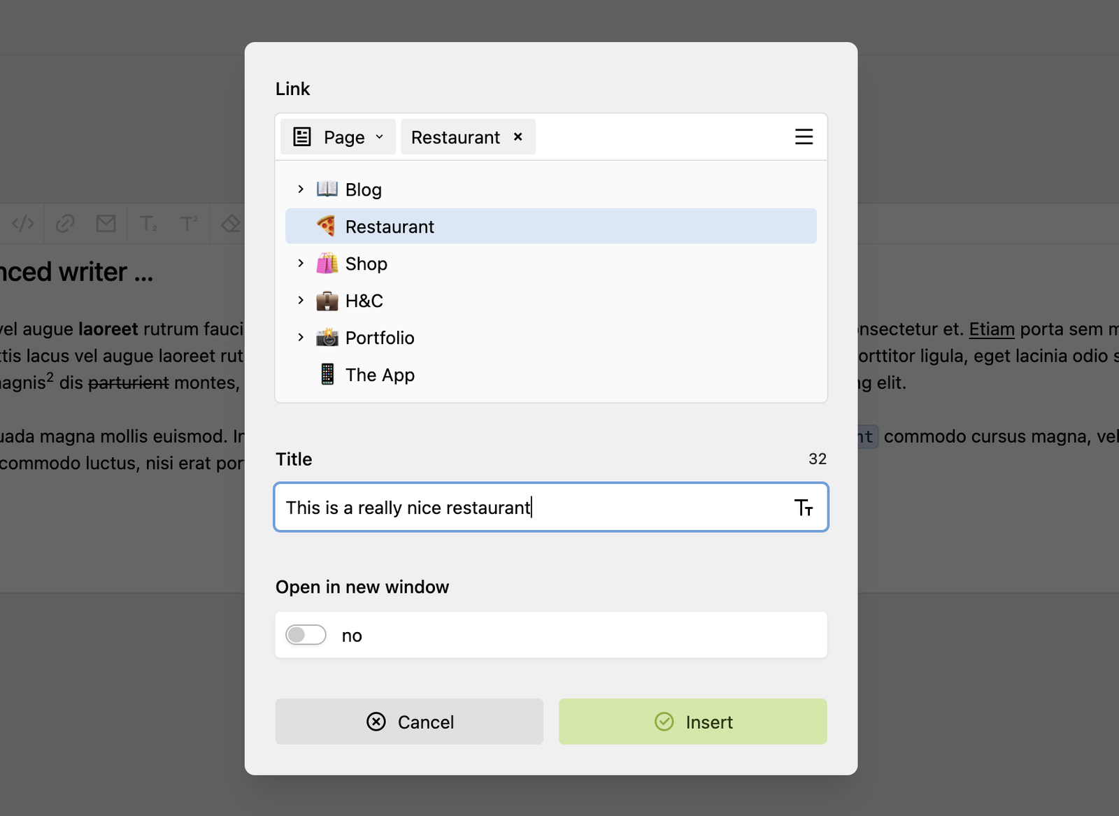
Link to internal pages & files with our new link field in the link dialog. No more guessing of URLs.
fields:
  text:
    type: writer
    toolbar:
      inline: false
      marks:
        - bold
        - "|"
- linkfields:
text:
type: writer
headings:
- 2
- 3
- 4fields:
text:
type: writer
marks:
- sub
- sup
- clearfields:
text:
type: writer
minlength: 10
maxlength: 360
counter: falseWriter Plugins
You need a block or inline format that’s not available? Create your own marks and nodes with our brand new extension API for Writer plugins.
panel.plugin("acme/writer", {
  writerNodes: {
    blockquote: {
      // ...
    },
  }
  writerMarks: {
    mention: {
      // ...
    },
  },
};Default page model
Set a new page standard
<?php

use Kirby\Cms\Page;

class DefaultPage extends Page
{
    /**
     * This method is now available for all pages
     * unless they have their own page model.
     */
    public function myCustomMethod(): string
    {
        return 'Hello world';
    }
}
The default page model kicks in when there is no specific model for a page.
Of course, other models can extend the default page model, too.
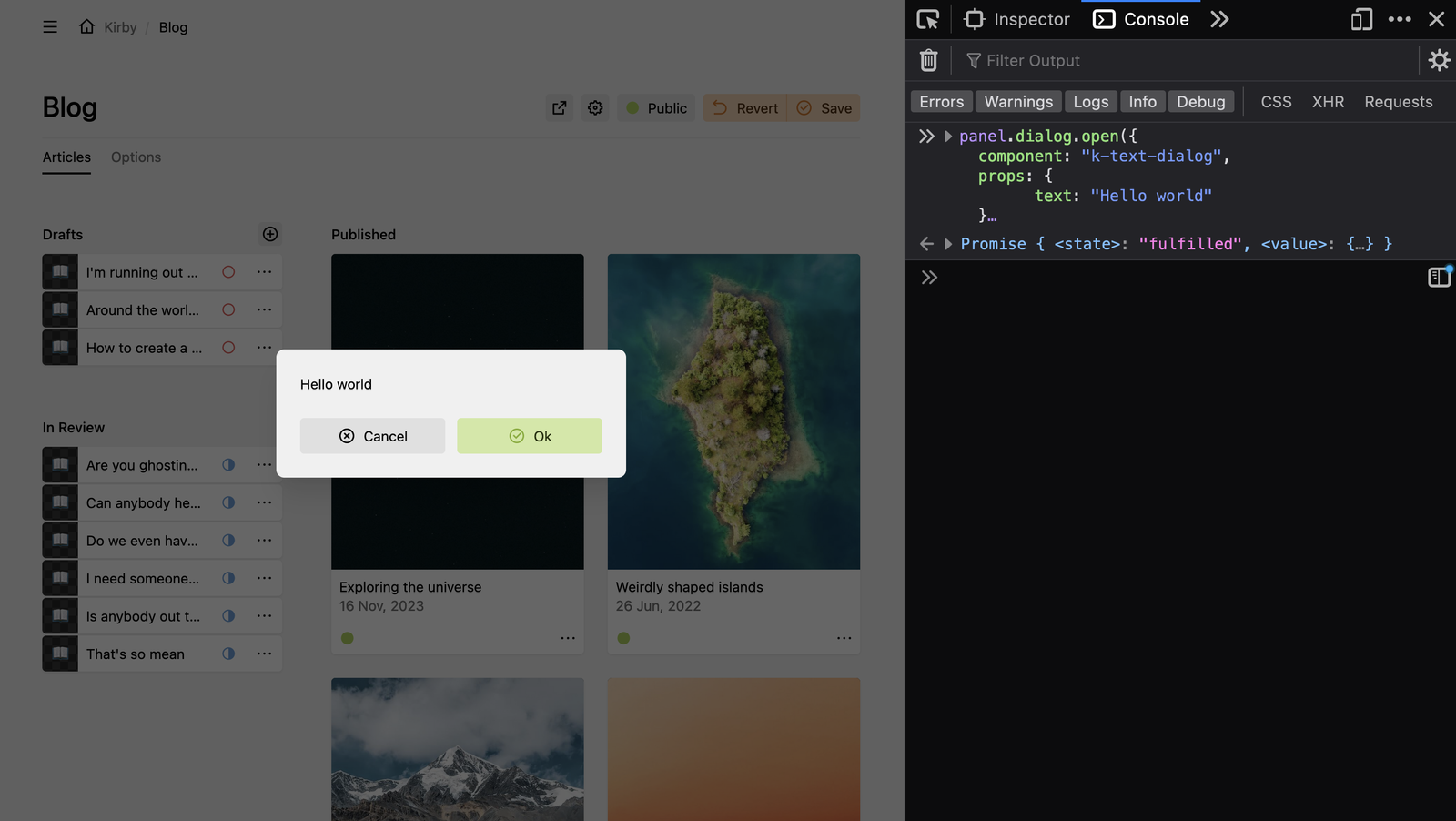
Panel JavaScript API
Remote control
Our new Panel JavaScript API gives you access to the most important Panel features. Control dialogs, drawers, notifications and more from your plugins, your custom panel.js or even the console.
PHP 8.3
PHP moves forward, we do too
New Versioning Scheme
Semantic Versioning
| {generation} | {major} | {minor} | {patch} |
|---|---|---|---|
| 3 | 9 | 0 | 0 |
| 3 | 10 | 0 | 0 |
| 3 | 11 | 0 | 0 |
| {major} | {minor} | {patch} | |
|---|---|---|---|
| 3 | 9 | 0 | |
| 4 | 0 | 0 | |
| 5 | 0 | 0 |
Key points
- Kirby now follows semantic versioning
- Major versions will be released on a yearly cycle to bring continuity and planning security.
- Licenses include three years of feature updates
Example roadmap
- 4.0.0: late 2023
- 5.0.0: late 2024
- 6.0.0: late 2025
Changelog
Ch-ch-ch-changes
Core improvements
QR Code generation
Kirby's new Kirby\Image\QrCode class, qr() helper function and ->toQrCode() field method allow you to create QR Codes right out of the box:
$qr = new Kirby\Image\QrCode('https://getkirby.com');
$qr->toSvg(color: '#ff00ff');
$qr->toDataUri(color: '#ff00ff');

qr('https://getkirby.com')->toSvg();
$page->myLinkField()->toQrCode()->toSvg();
Support for UUIDs and permalinks in URL helper
You can now pass a page UUID, a file UUID or a permalink to the url() helper and it will be converted to the actual URL:
<?= url('page://abcd') ?>
<?= url('file://abcd') ?>
<?= url('/@/page/abcd') ?>
<?= url('/@/file/abcd') ?>
This will also work for other URL methods like $field->toUrl(), Url:to(), etc.
Support for UUIDs in API calls
You can now use UUIDs in API calls to request pages and files. #4769
/api/pages/@$pageUUIDThe UUIDs must be passed without scheme, but a prefixed @. I.e.:
// Nope
/api/pages/page://abcd

// Yes
/api/pages/@abcd
File routes can also handle file UUIDs for files and parents:
/api/pages/@$pageUUID/files/$filename
/api/pages/@$pageUUID/files/@$fileUUID
In addition to that there are new direct UUID file routes:
/api/files/@$fileUUIDBetter plugin asset handling
- New
assetsplugin extension that allows plugins to specify assets from custom paths and with a wider range of extensions than previously supported - New
Kirby\Cms\Plugin::assets()andKirby\Cms\Plugin::asset($assetName)methods - New
Kirby\Cms\PluginAssetobject with many methods, e.g.$plugin->asset('styles.css')->url() - Plugin asset media url contains a modification timestamp to easily cachebust (e.g.
/media/plugins/getkirby/test-plugin/2375797551-472389240/styles.css) css()andjs()helpers support passing plugin and plugin assets objects to include all assets of the plugin:
css([
  'assets/css/index.css',
  $kirby->plugin('foo/bar')
]);

css([
  'assets/css/index.css',
  $kirby->plugin('foo/bar')->assets(),
]);

css([
  'assets/css/index.css',
  $kirby->plugin('foo/bar')->asset('styles.css'),
]);
New SymmetricCrypto class
Kirby\Toolkit\SymmetricCrypto is a user-friendly and safe abstraction for symmetrical authenticated encryption using the PHP sodium extension:
use Kirby\Toolkit\SymmetricCrypto;

// encryption/decryption with a password
$crypto     = new SymmetricCrypto(password: 'super secure');
$ciphertext = $crypto->encrypt('a very confidential string');
$plaintext  = $crypto->decrypt($ciphertext);

// encryption with a random key
$crypto     = new SymmetricCrypto();
$ciphertext = $crypto->encrypt('a very confidential string');
$secretKey  = $crypto->secretKey();

// encryption/decryption with a previously generated key
$crypto     = new SymmetricCrypto(secretKey: $secretKey);
$ciphertext = $crypto->encrypt('a very confidential string');
$plaintext  = $crypto->decrypt($ciphertext);
New LazyValue class
Kirby\Toolkit\LazyValue allows to protect a closure function from being called by other code that is testing for instanceof Closure:
$value = new LazyValue(fn ($a, $b, $c) => 'please protect me');

// ...

if ($value instanceof Closure) {
  // we would hate if our value gets unwrapped here,
  // that's why we cannot use a normal closure but LazyValue
  $value = $value();
}

// ...

// finally we want to unwrap our protected closure
if ($value instanceof LazyValue) {
  $value = $value->resolve($a, $b, $c);
}
More improvements
- New
$field->permalinksToUrls()method for writer fields - Extensions to add custom methods for structures and structure objects
- New
Kirby\Toolkit\Str::camelToKebab()method Str::template()supports single and double curly braces as start/end delimiters by defaultXml::attr(): Support passing an empty string as value to generate an attribute with an empty value- New
Kirby\Cms\App::models()method that returns a generator for each model (site, files, pages and users) of the site - New
Kirby\Cms\File::blueprints()method that collects valid blueprints from the files sections and files fields of the parent model - Fields can now define
'hidden' => true(component notation) or::isHidden(): bool(class-based) to make them non-rendering - New
languages.variablesconfig option to disable managing translations in the Panel - New
Kirby\Cms\File::changeTemplate()method - New file permissions for
changeTemplate,accessandlist - New
file.changeTemplatehooks - New
Kirby\Filesystem\F::safeExtension()method - New
Kirby\Filesystem\F::safeBasename()method Kirby\Toolkit\Str::date()and its dependents (e.g.Kirby\Filesystem\F::modified(),Kirby\Filesystem\File::modified(),Kirby\Filesystem\Dir::modified()) now respect the globally configured date handler- New
$date->formatWithHandler()method for Kirby date objects that allows to use different date handlers or even the globally configured one (default). - New
Kirby\Email\Email::toArray()andKirby\Email\Body::toArray()methods - New
Kirby\Exception\AuthExceptionclass - Dom: New
allowHostRelativeUrlssanitization option (trueby default) to perform less strict checks when the HTML<base>element is used - Dom: Custom sanitization callbacks for attributes, elements and the doctype now also receive the
$optionsarray - Sane: New
$isExternalmode specifically for external files that may be accessed directly - More detailed security policy for GitHub
Panel improvements
Dialogs for fields
Fields can now define their own dialogs on the backend:
- Fields with array definition:
return [ 'props' => [ // ... ], 'dialogs' => function () { return [ [ 'pattern' => 'delete', 'load' => function () {}, 'submit' => function () {}, ] ]; } ]; - Field classes:
class MyField extends FieldClass
{
  public function dialogs(): array
  {
    return [
      [
        'pattern' => 'delete',
        'load' => function () {},
        'submit' => function () {},
      ]
    ];
  }
}
The route patterns for field dialogs are automatically prefixed with the following scheme:
dialogs/$modelPath/fields/$fieldName/$patternHere's an example:
dialogs/pages/blog/fields/blocks/deleteIn a field component, the dialog can be opened by using the field endpoint:
this.$dialog(this.endpoints.field + "/delete")Customization of the layout selector
The layout selector is now customizable with the size (small, medium, large, huge) and columns options via the new selector prop:
layout:
  type: layout
  layouts:
    ...
  selector:
    # `small`, `medium`, `large` or `huge`
    size: huge
    columns: 6
More improvements
- Disabled buttons can receive focus (tab) which allows them to be read out by screenreaders.
- Structure fields don’t disregard content changes anymore when clicking outside the form (now drawer).
- Correct autofocus handling for blocks, layout, structure, picker fields and dropdowns
- Improved focus styles for links and the flag preview in tables
- All minified panel assets now add
.minto the filename. This will avoid auto-minification in Cloudflare and possibly other environments. - Improved text overflow behavior for links in tables
- Increase the font size for help text in sections and fields
- The multiselect and tag dropdowns now offer more space to not cut off longer options.
- Slug field: respect custom slug allowlist from the
Strclass - Pages section: new
templatesIgnoreoption #5322 - Users field: set
default: trueto always use the currently logged in user as default - New items size
full
New Icons
We've added new icons to our Panel iconset: anchor, clear, lab, merge and split.
New Components
<k-alpha-input><k-browser><k-code><k-color-frame><k-coloroptions-input><k-colorname-input><k-dialog-body><k-dialog-box><k-dialog-buttons><k-dialog-fields><k-dialog-footer><k-dialog-form><k-dialog-notification><k-dialog-search><k-dialog-text><k-drawer-body><k-drawer-fields><k-drawer-header><k-drawer-notification><k-drawer-tabs><k-file-browser><k-frame>,<k-icon-frame>and<k-image-frame><k-hue-input><k-navigate><k-notification><k-page-tree><k-search-input><k-stat><k-text-drawer><k-tree>
New helpers
$helper.focus(element)$helper.object.length(object)$helper.string.isEmpty(string)$helper.url.base$helper.url.buildQuery$helper.url.buildUrl$helper.url.isAbsolute$helper.url.isSameOrigin$helper.url.isUrl$helper.url.makeAbsolute$helper.url.toObject$library.colors
New JS error classes
RequestErrorJsonRequestError
And so much more
We've tweaked the Panel extensively with too many improvements to name them all. But here are some more:
- Load Panel area views dynamically with the new
whenprop - Each Panel area can now define additional requests for simple data endpoints or actions
- Syntax highlighting in the
k-codewith Prism - Text fields: new
font: monospaceoption panel.cssandpanel.jsconfig options now also support arrays with multiple entries as well as absolute URLsk-paginationcan always be navigated by keys (no extra prop needed anymore)- Notifications: support for custom icons
k-tagsupports an image/icon frame- New
disabledproperty for thek-options-dropdowncomponent - New
selectedproperty fork-buttonto set thearia-selectedattribute
Bug fixes
- Removed flickering from
k-paginationwhen navigating - Fixed name of default blueprints to
pages/defaultandfiles/default - Blocks: batch selection allows deselecting blocks
- Blocks: batch selection gets deselected on Escape key
- Fixed i18n translate issues, e.g. for the user blueprint title #4869
- Writer field: Email mark toolbar button title is properly translated now
- Empty required Writer field now shows proper invalid styling in Panel
- UUIDs are less often generated when not needed to be generated
- Kirby queries now differentiate between integers and floats as arguments
- Kirby no longer hides errors in the response class when the response is converted to a string #5027
- Files field upload: use
upload.parentfor mime check #5245 $field->toUrl()will returnnullon empty fields #5259- Users field does not use a default anymore if none set
- The "Session ... is currently read-only because it was accessed via an old session" error is circumvented when the PHP
sodiumextension is available - Removed the error boundary from
<k-fieldset>; the error boundary kills the entire field/input if an error occurs, which is way too aggressive and also makes it more difficult to handle errors properly. App::multilang()andApp::defaultLanguage()are correctly updated on changes to language data #5342- Prevent unnecessary runs in
Language::update()when updating the default language - Block title: certain HTML characters are now properly unescaped in the label #5346
Refactoring
Core
- Throw proper errors when thumbnails cannot be generated
- Removed
config/blueprintsdirectory with dead block blueprints and moved default blueprints for site, page and file to in-code arrays inKirby\Cms\Core::blueprints() - Removed
Kirby\Toolkit\Propertiestrait fromKirby\Api\Api,Kirby\Cms\Api,Kirby\Email\Email,Kirby\Email\Body,Kirby\Cms\Auth\Status,Kirby\Cms\App,Kirby\Cms\ContentTranslation,Kirby\Cms\ModelWithContent,Kirby\Toolkit\Pagination,Kirby\Http\Uri,Kirby\Cms\FileVersion,Kirby\Filesystem\Asset,Kirby\Filesystem\File,Kirby\Image\Imageclasses andKirby\Filesystem\IsFiletrait Kirby\Cms\Language,Kirby\Cms\Plugin,Kirby\Cms\RoleandKirby\Cms\StructureObjectdon't extendKirby\Cms\Model(and thus also don't use theKirby\Toolkit\Propertiestrait) anymoreKirby\Cms\StructureextendsKirby\Cms\ItemsandKirby\Cms\StructureObjectextendsKirby\Cms\Item- New
Contentnamespace- Moved the
Content,ContentTranslationandFieldclasses into the new namespace (compatibility aliases are provided for now) - New internal
ContentStorageclass that currently holds more of the storage related business logic - New internal
ContentStorageHandlerinterface and internalPlainTextContentStorageHandlerclass to bundle all low-level content logic in one place
- Moved the
- Whoops is now generally disabled during PHPUnit test runs to reduce memory usage during tests
Panel
- More frontend unit tests
- Cleaned up
k-toolbarcomponent - New drawer component structure:
<k-overlay type="drawer"> <form class="k-drawer" method="dialog"> <k-drawer-notification /> <k-drawer-header /> <k-drawer-body> <k-drawer-fields /> </k-drawer-body> </form> </k-overlay> - Portals: Dialogs, Drawers and other Overlays are now separated into different portals. This is done by setting the overlay type:
<k-overlay type="dialog"><k-overlay type="drawer"><k-overlay>
An overlay without a type will use the default overlay portal. Separating them into different portals gives us more control overz-indexand layering of elements.
- Removed
v-modelfromk-formandk-fieldset - Removed
$listenersusage fromk-draggable,k-buttonand subcomponents,k-link,k-headline,k-form,k-block,k-block-title,k-box,k-image,k-content-item - Made
k-bubblemore flexible - Use the Vue object syntax for dynamic
:styleattributes to enhance the robustness and security - Reduce JS forEach usage
Deprecated
Core
- Files in a plugin's
assetsdirectory are now always assumed to be public, independent of their file extension. If your plugin needs to store other files in the assets directory, please use the newassetsextension to explicitly define the public assets. - Passing a single space as value to
Xml::attr()(with the intention to generate an attribute with an empty value) has been deprecated in favor of passing an empty string. Kirby\Cms\Model: UseKirby\Cms\ModelWithContentinsteadKirby\Email\Email::clone()andKirby\Email\Body::clone()Page::isReadable(): UsePage::isAccessible()instead- The name
queryshould not be used for custom API endpoints anymore, it will be used for the Kirby QL (KQL) plugin/core implementation - Internal
$model->contentFile(),$model->contentFiles(),$model->contentFileDirectory(),$model->contentFileExtension()and$model->contentFileName()methods have been deprecated and will be removed in v5.
Panel
- Custom icons using a 16x16 viewbox have been deprecated. In an upcoming version, Kirby will only support custom icons with a 24x24 viewbox by default. If you want to continue using icons with a different viewport, please wrap them in an
<svg>element with the correspondingviewBoxattribute. - Icons
circle-outline,heart-outlineandstar-outline: Usecircle,heartandstarinstead this.$events: Usethis.$panel.eventsinsteadthis.$panel.events.$on: Usethis.$panel.events.oninsteadthis.$panel.events.$off: Usethis.$panel.events.offinsteadthis.$panel.events.$emit: Usethis.$panel.events.emitinsteadthis.$store.dispatch("isLoading"): Usethis.$panel.isLoadinginsteadthis.$translation: Usethis.$panel.translationinsteadthis.$store.dispatch("dialog"): Usethis.$panel.dialog.openandthis.$panel.dialog.closeinsteadthis.$store.dispatch("drag", drag): Usethis.$panel.drag = draginsteadk-dropdown: Usek-dropdown-contentas standalone insteadk-calendarwas renamed tok-calendar-input;k-calendaris still available but only as deprecated alias.
Breaking changes
Core
- Kirby 4 requires at least PHP 8.1 and supports up to PHP 8.3.
- When impersonating the almighty
kirbyuser, any permission check will succeed even if permission has been disabled for regular admins. - The
twittericon, KirbyTag and helper have been removed. Use the legacy plugin if you still rely on these: legacy-twitter.zip - We have added more native PHP type hints throughout the system. When extending core classes, this might require you to update your method to include those type hints as well.
- Users field doesn't automatically use the current user as default, add
default: trueto keep this functionality. - When thumb generation fails, the image API now throws an error and no longer loads the original image.
- Files:
manipulateis now a core method andfocusa reserved field by the core. These names are no longer available for custom file methods. Previous content fields with these names can only be accessed via e.g.$file->content()->get('manipulate'). I18n::translate(): If$fallbackis an array and neither the array$keynor the array$fallbackhave a matching entry for the locale, the first element of the$keyarray will now be returned (not anymore the one from$fallback). If$fallbackis a string, it will be considered with priority over both of these.- If overwriting the
hiddenfield, it must return'hidden' => truenow. - Removed deprecated
DSconstant. Use/instead. - When sanitizing DOM objects (e.g. in the writer field, but not during the sanitization/validation of uploaded files), host-relative URLs that point outside the site root are now allowed as the use of the HTML
<base>element is assumed for sites in a subfolder. To revert to the old, strict behavior, set Sane'sallowHostRelativeUrlsoption tofalse. - Renamed parameter of
::group()method of all collection classes to$caseInsensitive - Errors are no longer hidden when a
Responseis converted to a string. - The
$translations->start()and$translations->stop()methods were no longer in use and have been removed. Content files are automatically converted by theLanguageclass. $languages->codes()now returns['default']for single language installations.Kirby\Panel\Assets::custom()now returns an array.Kirby\Uuid\Uuidis now an abstract class, child classes need to implement theidmethod.Kirby\Uuid\Uuid::key()can now also returnnullif the new$generateparameter isn't passed astrueand no UUID has yet been generated for the model.Kirby\Cms\ModelWithContentdoesn't extendKirby\Cms\Modelanymore.- Removed the
::clone()method fromKirby\Cms\Auth\Status,Kirby\Http\Uri,Kirby\Cms\FileVersion,Kirby\Filesystem\Asset,Kirby\Filesystem\File,Kirby\Image\Image,Kirby\Cms\Plugin,Kirby\Cms\Role,Kirby\Cms\StructureObjectandKirby\Cms\ContentTranslationclasses - Removed the
::hardcopy()method fromKirby\Api\Api,Kirby\Cms\Api,Kirby\Email\Email,Kirby\Email\Body,Kirby\Cms\Auth\Status,Kirby\Toolkit\Pagination,Kirby\Http\Uri,Kirby\Cms\FileVersion,Kirby\Filesystem\Asset,Kirby\Filesystem\File,Kirby\Image\Image,Kirby\Cms\Role,Kirby\Cms\StructureObjectandKirby\Cms\ContentTranslationclasses - Removed
::site()method fromKirby\Cms\Plugin,Kirby\Cms\RoleandKirby\Cms\StructureObjectclasses - Removed
::kirby()method fromKirby\Cms\RoleandKirby\Cms\StructureObjectclasses - Unauthenticated API and Panel calls now return a correct 401 HTTP code instead of 403.
- Registering a default block model now needs to be done with the key
default, notKirby\Cms\Block. new Kirby\Cms\Structure()/new Kirby\Cms\StructureObject()don't work anymore as before. UseKirby\Cms\Structure::factory()/Kirby\Cms\StructureObject::factory()instead.Kirby\Cms\Items::factory()and all inheriting classes throw an exception now if malformed data is passed.- Extending the internal
$model->contentFile(),$model->contentFiles(),$model->contentFileDirectory(),$model->contentFileExtension(),$model->contentFileName(),$model->readContent()and$model->writeContent()methods in a page model will no longer have an effect as these methods are no longer called by the core. Please extend the newKirby\Content\PlainTextContentStorageHandlerclass instead and return an instance of your custom class from$model->storage(). Please note that the interface ofPlainTextContentStorageHandleris internal and may change in the future. - New
$isExternalargument for theKirby\Sane\Handler::sanitize()andKirby\Sane\Handler::validate()methods that custom Sane handlers need to implement; it allows to differentiate between strings from external files that may be accessed directly and strings that will end up directly on the page.
Panel
- Blocks: Removed keyboard shortcut to move block focus up/down
- Removed
road-signicon - The icons
circle,heartandstarare now namedcircle-filled,heart-filledandstar-filled. - Removed
this.$config.searchfrom Panel - Area
searchplugins receive two additional arguments for their query callback:$limitand$pageto be used to paginate the results. They should then return an array with entries results and pagination. #5191 <k-header>doesn't include tabs anymore by default. Use<k-tabs>separately.- Defining the footer slot in
<k-dialog>will no longer wrap the slot content in the<footer>element. This can now be more flexibly handled by using<k-dialog-footer>inside the slot. - The form drawer no longer automatically closes on submit. This is introducing the same behaviour as in dialogs. Auto-closing might often not be the intended result of submitting the form and it's easier to close it manually in a submit handler than to re-open it again.
this.$store.state.isLoadingis no longer available. You can now usewindow.panel.isLoadingorthis.$panel.isLoadingin Vue components to access the current loading state.this.$store.state.dialogis no longer available. Usethis.$panel.dialoginstead.- Removed
this.$store.state.drag, usewindow.panel.drag/this.$panel.draginstead. <k-button>,<k-link>,<k-headline>and<k-content-item>only emit theclickevent. For other native events, use the.nativeevent listener modifier.- Native events (e.g.
click,dbclick) need the.nativemodifier now when used on<k-block>and<k-block-title> - Need to use
.nativemodifier for all previous event listeners on<k-boxand<k-image> <k-pagination>doesn't support setting custom labels/titles vianextLabel,prevLabelorpageLabel<k-rangewas removed and replaced by<k-alpha-range>and<k-hue-range>.<k-choice>has been removed. Use<k-choice-input>instead.- The unused theme prop has been removed from
<k-choice-input>.
Removed deprecated code
- The
Kirby\Form\Options,Kirby\Form\OptionsApiandKirby\Form\OptionsQueryclasses have been removed. UseKirby\Option\Options,Kirby\Option\OptionsApiorKirby\Option\OptionsQueryinstead. - The
Kirby\Toolkit\Queryclass has been removed. UseKirby\Query\Queryinstead. - Passing the
$slotor$slotsvariables to snippets was deprecated and support has now finally been removed. - Passing an empty string as value to
Xml::attr()(deprecated in Kirby 3.9) no longer omits the attribute but generates an attribute with an empty value.
QR Code® is a registered trademark of DENSO WAVE INCORPORATED.
Migration from previous versions
Kirby 4 is a major release and requires some changes to existing sites. To ease the transition, we have compiled everything you need to know in a handy guide: