Page blueprint
Page blueprints are located in /site/blueprints/pages and control the Panel setup and form fields for pages.
Blueprint location
- /site/blueprints/pages
Default page blueprint
To create the same set of fields for all pages, you can setup a default.yml that is used whenever no custom page blueprint is configured.
- /site/blueprints/pages/default.yml
Title
The title is required and will appear in the list of selectable templates when a new page is created and multiple templates are available.
title: ArticleTranslated titles
The title can be translated by passing an array of translations with the matching language code as key:
title:
  en: Article
  de: Artikel
Sorting
The num option defines which numbering scheme to use when a page is published.
Default sorting is numbering (1 to x) and doesn't need any setup.
Alphabetical sorting by page uid
num: zeroSorting by a custom sort number field
You may use a field value, for example from a field called customSortNumberField, to customize the sort order:
num: '{{ page.customSortNumberField }}'The return value of the query has to be an integer which will be used for sorting. Learn more about Kirby's query language.
Chronological sorting by date field
If your page blueprint contains a date field, you can use that date (and, optionally time) to sort your pages chronologically. For example, for a date field named created, you can apply the following:
By date
num: '{{ page.created.toDate("Ymd") }}'By datetime
num: '{{ page.created.toDate("YmdHi") }}'If you use a sorting scheme other than default sorting by number, i.e. automatic sorting, manual sorting in the Panel will be disabled.
Statuses
With the status option, you define the page statuses you want to allow for the page. You can also change their label and description. This option gives you a lot of flexibility how you want to use page status in your website.
The draft status of a page can not be removed or disabled – only its label and description can be changed.
Simple example
status:
  draft: Draft
  listed: Published
Extended example
status:
  draft:
    label: Draft
    text: The article is still in draft mode. It can only be seen by editors with Panel access.
  unlisted:
    label: In Review
    text: The article is online and can be visited with the direct URL. The team must still give the final go to publish it.
  listed:
    label: Published
    text: The article is online and listed in the blog
Page creation dialog
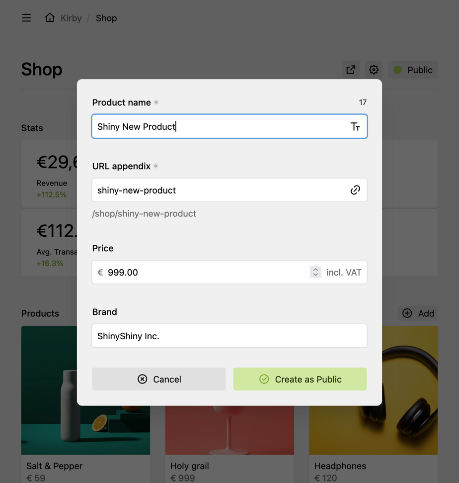
You can customize the page creation dialog that pops up when you create a new page. You can add fields, change the label of the title field, disable the automatic redirect to the new page and set its status.
title: Product
create:
  title:
    label: Product name
  fields:
    - price
    - brand
  redirect: false
  status: listed
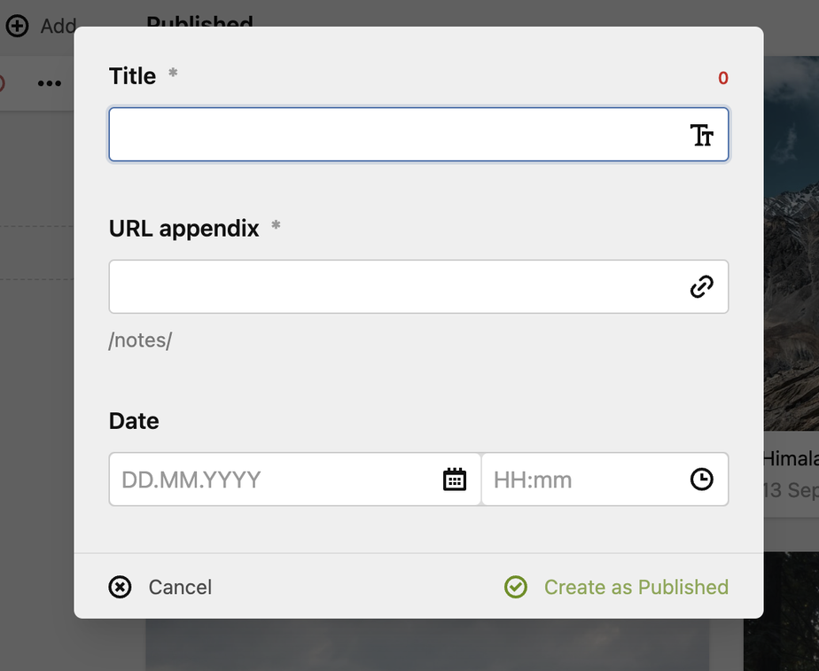
The button label changes depending on the status option set:

Page creation dialog
An example how to customize the page creation dialog for building a bookmark tool.
Automatic title and slug
The page create dialog also allows you to automatically generate title and/or slug instead of allowing the user to edit them manually. To do so, define the title and/or slug suboption as a string template:
create:
  title: "{{ page.location }} – {{ page.date.toDate('M Y') }}"
  slug: "{{ page.location.slug }}-{{ page.date.toDate('Y-m-d') }}"
  fields:
    - location
    - date
Note that the page fields you want to query within the string template need to be in the list of fields within the create option (in this example, location and date), and those fields need to be present in the page blueprint itself.
However, you can also query information not specific to the current page through the kirby or site entry points.
This means, you could, for example, create a custom site method that returns the current Unix timestamp, and use that in your string template:
create:
  title: "{{ site.time }}"
  slug: "{{ site.time }}"
And in a plugin, define the method
<?php

Kirby::plugin('getkirby/custom-methods', [
  'siteMethods' => [
    'time' => function() {
      return time();
    }
  ]
]);
If title and slug are generated automatically, and no custom fields are defined for the page creation dialog, the dialog will be skipped and the page is created immediately.
Supported field types
Currently, the list of supported field types in the dialog is limited to checkboxes, date, email, info, line, link, list, number, multiselect, radio, range, select, slug, tags, tel, text, toggles, time, url. Custom field types are disabled by default. To enable them, add your field type name to:
Kirby\Panel\PageCreateDialog::$fieldTypes[] = 'yourFieldType'Options
With options, you can control all the page actions that should or should not be available for this particular page type. The option dropdown for pages will adjust accordingly.
| Option | Value | Description |
|---|---|---|
access |
true/false |
page is not accessible and not listed |
changeSlug |
true/false |
|
changeStatus |
true/false |
|
changeTemplate |
false or list of allowed template |
|
changeTitle |
true/false |
|
create |
true/false |
|
delete |
true/false |
|
duplicate |
true/false |
|
list |
true/false |
page is accessible but not listed |
move |
true/false |
|
preview |
true/false/template string (see below) |
|
read |
true/false |
page is not accessible and not listed (will be deprecated in Kirby 5) |
sort |
true/false |
|
update |
true/false |
Each option can be set on a per user role for fine-grained permissions, for example:
options:
  delete:
    admin: true
    editor: false
Or using a wildcard to change the default for all roles:
options:
  update:
    *: false
    editor: true
Controlling accessibility for roles.
# Page is not accessible and not visible for all roles except admins.
options:
  access:
    *: false
    admin: true
  list:
    *: false
    admin: true
Different option values per role currently don't work for the changeTemplate option (which takes a fixed list of allowed templates) or the preview option. These two options can only be controlled for all roles at once.
Icon
The icon can either be one of our own icons or an emoji. Icons appear in page lists when no preview image is available.
icon: pageEmoji
icon: 📚image options
The (preview) image blueprint option defines how any page with this blueprint will be presented, e.g. in a pages section:
image: page.cover.toFileWith the Kirby query syntax, it allows you to specify which image to use to preview this page. However, it doesn't need to stop there. You can also specify the background or what icon instead of an image to use.
Show icon instead of image
To display the icon set in the page blueprint or a default icon instead of a preview image, you can set the image option to icon:
image: iconOr when defining other options, set the query option to false:
image:
  back: blue
  query: false
To show no image or icon at all, you can set the image option to false:
image: falsequery
When defying other image preview options, you can use the query option for setting which image to use. It defaults to page.image.
image:
  query: page.children.first.image
Make sure that the queries return the right format for each option. For example, the query option expects a Kirby\Cms\File object, so use toFile when necessary.
Preview image from assets folder
You can also provide an image from the assets folder via a page model or custom page method, for example as a fallback if the page has no images:
<?php

class AlbumPage extends Page
{
    public function previewImage()
    {
        if ($image = $this->images()->first()) {
          return $image;
        }
        if (file_exists(kirby()->root('assets') . "/images/default.jpg")) {
            return new Asset("assets/images/default.jpg");
        }
        return false;

    }
}
And then in your blueprint
image: page.previewImageback
Sets the image background.
image:
  query: page.image.findBy("name", "cover")
  cover: true
  ratio: 1/1
  back: black
Examples
Custom colors
The back and color options for also support shorthands for the core CSS color variables as well as HEX codes or other native CSS color properties (e.g. even gradients).
image:
  back: "purple-400"
Check out the list of our color properties for available options.
image:
  back: "#ff0000"
image:
back: "linear-gradient(90deg, rgba(2,0,36,1) 0%, rgba(9,9,121,1) 35%, rgba(0,212,255,1) 100%)"Support for queries
This option also support our powerful queries:
image:
  back: "{{ page.myCustomBackColor }}"
color
Sets the icon color. Allows for the same shortcuts and query support as the back option.
image:
  query: false
  color: red-200
image:
query: false
color: "{{ page.myCustomIconColor }}"cover
Whether or not the image will cover the available space.
Options: true, false (default)
image:
  cover: true
Examples
ratio
A freely selectable image ratio
image:
  ratio: 16/9
Examples
You are not limited to the example ratios above. In fact, Kirby calculates the ratio for you as long as you enter it in the format a/b
Preview
You can change the link of the preview button or disable it entirely with the option setting.
Disabling the preview button
For some pages it makes sense to disable the preview entirely.
options:
  preview: false
Custom link
The preview option can also take any absolute link or a template string.
Absolute URL
options:
  preview: https://preview.mysite.com
Template string
You can use Kirby's powerful query syntax to create any link dynamically.
options:
  preview: "{{ page.parent.url }}/#{{ page.slug }}"
Change templates
You must define a list of compatible templates with the changeTemplate option to allow editors to switch between page templates.
options:
  changeTemplate:
    - video-post
    - link-post
    - text-post
When an editor switches templates, all fields with the same name and type will be synced. Incompatible fields will be discarded. Be aware of this step when you define the list of compatible templates.
Navigation option
The previous/next item navigation in the Panel is a very effective way for editors to move between content. With navigation option you can improve the usability of the navigation for your users with additional options to customize the links.
Navigate between all pages
title: Simple Page
navigation:
  status: all
  template: all
Limit navigation by template & status type
title: Simple Page
navigation:
  status:
    - draft
    - unlisted
  template:
    - album
    - default
Adjust the sorting of the previous/next page
title: Simple Page
navigation:
  status: listed
  template: default
  sortBy: title asc
Since 5.0.0
View buttons
Kirby allows you to define what buttons to use for this page. To select which (default) buttons to show on a particular view you can set the buttons option in the corresponding blueprint:
buttons:
  settings: true
By setting the value to true, you can reference existing buttons (from the core or config.php file or even Panel area plugin extensions) by name and decide which ones to include and in what order.
Create a new button
You can now also define your own custom buttons directly in a blueprint:
buttons:
  settings: true
  social:
    icon: mastodon
    text: Mastodon
    link: "https://mastodon.social/@getkirby"
    theme: purple-icon
The available options are based on the k-view-button component. Check out the config option documentation for more details, e.g. in regard to available attributes or query support.
Disable all buttons
buttons: falseExamples
You can find examples of different types of page blueprints in the samples section.


