panel.viewButtons
Customize the buttons shown on Panel views
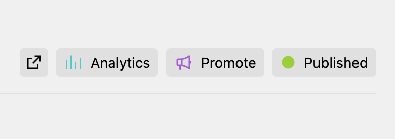
With the panel.viewButtons config option, you can customize which buttons to show on different views in the Panel (e.g. page, site, file, user, language).
Default buttons for a Panel view type
In contrast to defining the buttons in a blueprint, the config option defines them not for a specific template but in general as default for the different view types (page, file, site, user, system, ...):
'panel' => [
  'viewButtons' => [
    'site' => [
      'preview',
      'analytics' => [
        'icon' => 'chart',
        'text' => 'Analytics',
        'link' => 'https://my-analytics.com/'
      ]
    ]
  ]
]
The available options are based on the k-view-button component. For example, instead of the link option, point the dialog option to your dialog endpoint to open it when clicking the view button.
You can mix referencing existing view buttons (e.g. preview in the above example) as well as custom view buttons.
Referencing buttons
If you reference a button by name, these could be one of the buttons that Kirby includes by default or one provided by a Panel area extension.
Kirby ships with the following buttons by default:
| Name | Description |
|---|---|
file.open |
Open file in new tab |
file.settings |
Settings dropdown for the file |
languages |
Dropdown to switch content language |
languages.create |
Create a new language |
language.open |
Opens language URL in new tab |
language.settings |
Settings dropdown for the language |
language.delete |
Deletes the language |
page.open |
Open page in a new tag |
page.preview |
Open preview view for the page |
page.settings |
Settings dropdown for the page |
page.status |
Page status switch dialog |
page.versions |
Dropdown to switch between the page's content versions |
site.open |
Open site in a new tag |
site.preview |
Open preview view for the site |
site.versions |
Dropdown to switch between the site's content versions |
users.create |
Create a new user |
user.settings |
Settings dropdown for the user |
user.theme |
Dropdown to switch user's theme |
You can omit the prefix while using the button in the respective view type. For example, when adding the file.settings button to a file view, you can simply reference it as settings instead of file.settings.
Referencing buttons from config in a blueprint
The custom view buttons you define in your config file can then also be referenced in a blueprint by name:
'panel' => [
  'viewButtons' => [
    'page' => [
      'analytics' => [
        'icon' => 'chart',
        'text' => 'Analytics',
        'link' => 'https://my-analytics.com'
      ]
    ]
  ]
]buttons:
preview: true
analytics: trueDisable all buttons
'panel' => [
  'viewButtons' => [
    'page' => false
  ]
]
Using the current context
For some buttons, the context in which the button is displayed might be relevant, e.g. the current page where the view button is shown. You have two ways to make use of the context:
- Using Kirby queries in e.g. the
linkoption - Accessing the object as callback argument
Query support
Some of the view button options do offer support for Kirby queries:
'panel' => [
  'viewButtons' => [
    'page' => [
      'analytics' => [
        'icon' => 'chart',
        'text' => 'Analytics',
        'link' => 'https://my-analytics.com/{{ page.uuid.id }}'
      ]
    ]
  ]
]
Query support is available for the dialog, drawer, icon, link, text and theme options.
Since 5.2.0
If you pass options as a string, it also supports Kirby queries, which can be useful when loading dropdown options dynamically.
Access current object
You can also define your custom view button as a closure and access relevant objects passed as arguments to the function:
'panel' => [
  'viewButtons' => [
    'page' => [
      'analytics' => function (Kirby\Cms\Page $page) {
        return [
          'icon' => 'chart',
          'text' => 'Analytics',
          'link' => 'https://my-analytics.com/' . $page->uuid()
        ];
      }
    ]
  ]
]
The available objects are
$kirby$site$user(current authorized user, if any)$model(if used on a model view, incl. the respective alias$page,$file,$user)
On a user view, $user will represent the object of the view. On these, you would need to access the currently authorized user via $kirby->user().