Buttons field
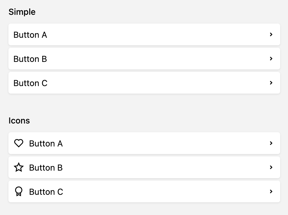
Sometimes a form needs more than fields: a link to the shop backend, a shortcut to the analytics dashboard or a button that starts a custom action. The buttons field puts them right next to the content.
Basic usage
Add a buttons field to any blueprint and define its buttons as a list:
fields:
  links:
    label: Links
    type: buttons
    buttons:
      - text: Shop
        icon: cart
        link: https://shop.example.com
      - text: Analytics
        icon: chart
        link: https://stats.example.com
      - text: Support
        icon: chat
        link: https://support.example.com
The field doesn't store a value. It only renders its buttons, one per row.
Button options
| Option | Type | Description |
|---|---|---|
text |
string, array |
Button text. Supports translation arrays and query templates. |
icon |
string |
Name of a Panel icon |
link |
string |
URL to open on click. Supports query templates. |
target |
string |
Link target, e.g. _blank to open the link in a new tab |
dialog |
string |
Path of a Panel dialog to open on click |
drawer |
string |
Path of a Panel drawer to open on click |
theme |
string |
Color theme, e.g. positive, negative, notice, info or a color like purple |
title |
string, array |
Tooltip text. Supports translation arrays and query templates. |
badge |
array |
Badge with text and theme in the top-right corner of the button |
disabled |
bool |
Disables the button |
Each button should define either link, dialog or drawer.
text, title, icon, theme, link, dialog and drawer are query templates, resolved against the current page, file, user or the site.
buttons:
  - text: "Open {{ page.title }} in the shop"
    icon: cart
    link: "https://shop.example.com/products/{{ page.sku }}"
    target: _blank
Themes
Themes like positive or purple color the whole button. Add -icon to a theme, e.g. purple-icon, to only color the icon and keep the button itself neutral:
buttons:
  - text: Report a problem
    icon: alert
    theme: negative-icon
    link: https://support.example.com
Open a link
link accepts absolute URLs and Panel URLs. This is handy to link to related places in the Panel:
buttons:
  - text: Shop settings
    icon: cog
    link: "{{ site.find('shop').panel.url }}"
  - text: Order dashboard
    icon: chart
    link: https://dashboard.example.com
    target: _blank
Open a dialog
dialog takes the path of a Panel dialog. That can be one of Kirby's own dialogs, for example the dialog to rename the current page:
buttons:
  - text: Rename this page
    icon: title
    dialog: "{{ page.panel.path }}/changeTitle"
The real power comes with your own dialogs. Define them in a Panel area of a plugin, then point the button to their path. Here's a button that opens a dialog to send the current page as a newsletter:
fields:
  actions:
    label: Actions
    type: buttons
    buttons:
      - text: Send as newsletter
        icon: email
        dialog: "{{ page.panel.path }}/newsletter"
The dialog route pages/(:any)/newsletter receives the page ID in its Panel notation, which Find::page() turns back into a page object:
<?php

use Kirby\Cms\App as Kirby;
use Kirby\Cms\Find;

Kirby::plugin('acme/newsletter', [
    'areas' => [
        'site' => [
            'dialogs' => [
                'page.newsletter' => [
                    'pattern' => 'pages/(:any)/newsletter',
                    'load' => function (string $id) {
                        $page = Find::page($id);

                        return [
                            'component' => 'k-form-dialog',
                            'props' => [
                                'fields' => [
                                    'subject' => [
                                        'label'    => 'Subject',
                                        'type'     => 'text',
                                        'required' => true
                                    ]
                                ],
                                'value' => [
                                    'subject' => $page->title()->value()
                                ],
                                'submitButton' => [
                                    'text'  => 'Send',
                                    'icon'  => 'email',
                                    'theme' => 'positive'
                                ]
                            ]
                        ];
                    },
                    'submit' => function (string $id) {
                        $page    = Find::page($id);
                        $subject = get('subject');

                        // send the newsletter with your mail service here

                        return [
                            'message' => 'The newsletter is on its way'
                        ];
                    }
                ]
            ]
        ]
    ]
]);
load returns the dialog component and its props. submit runs when the editor submits the dialog. Returning an array with a message closes the dialog and shows a success notification.
Open a drawer
Drawers work the same way. Point the button to the drawer's path:
buttons:
  - text: Version history
    icon: clock
    drawer: "{{ page.panel.path }}/history"
…and define the drawer in the drawers of a Panel area:
<?php

use Kirby\Cms\App as Kirby;
use Kirby\Cms\Find;

Kirby::plugin('acme/history', [
    'areas' => [
        'site' => [
            'drawers' => [
                'page.history' => [
                    'pattern' => 'pages/(:any)/history',
                    'load' => function (string $id) {
                        $page = Find::page($id);

                        return [
                            'component' => 'k-text-drawer',
                            'props' => [
                                'icon'  => 'clock',
                                'title' => 'Version history',
                                'text'  => 'Last modified on ' . $page->modified('Y-m-d H:i')
                            ]
                        ];
                    }
                ]
            ]
        ]
    ]
]);
Coming soon: Send a request
We are planning to let buttons send off a request to the backend directly, e.g. to trigger an action or a custom endpoint with a single click, without opening a dialog first. This isn't part of beta.1 yet.
Buttons from a query
Instead of a list, buttons also accepts a query. It has to return an array of button definitions. This lets you build buttons in PHP, e.g. in a page model:
fields:
  shop:
    label: Shop
    type: buttons
buttons: page.shopButtons<?php
use Kirby\Cms\Page;
class ProductPage extends Page
{
public function shopButtons(): array
{
$buttons = [
[
'text' => 'View in shop',
'icon' => 'cart',
'link' => 'https://shop.example.com/products/' . $this->sku(),
'target' => '_blank'
]
];
if ($this->stock()->toInt() === 0) {
$buttons[] = [
'text' => 'Out of stock: restock now',
'icon' => 'alert',
'theme' => 'notice',
'link' => 'https://inventory.example.com/products/' . $this->sku(),
'target' => '_blank'
];
}
return $buttons;
}
}Make sure the method returns a list (not an array with custom keys). If there are no buttons, the field shows an empty state.