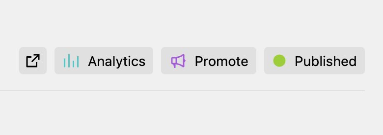
Panel view buttons
Kirby 5 adds a new extension that allows plugin developers to add custom view buttons to most views of the Panel (e.g. page, site, file, user, language). These buttons can be added alongside the default buttons, such as the preview button or settings dropdown button.
There are different ways to define a custom button: in a blueprint, in the config.php
, in a Panel area and/or as a full custom Vue component.
In a blueprint
A blueprint allows you to define what buttons to use for this type of pages/files/users etc. To select which (default) buttons to show on a particular view you can set the buttons
option in the corresponding blueprint:
buttons:
preview: true
settings: true
By setting the value to true
, you can reference existing buttons (from the config.php
or areas) by name and decide which ones to include and in what order.
Create a new button
You can now also define your own custom buttons directly in a blueprint:
buttons:
preview: true
settings: true
analytics:
icon: mastodon
text: Mastodon
link: "https://mastodon.social/@getkirby"
theme: purple-icon
The available options are based on the k-view-button
component.
Query support
Some options also do offer support for Kirby queries:
buttons:
preview: true
settings: true
analytics:
icon: chart
text: Analytics
link: "https://my-analytics.com/for/{{ page.uuid.id }}"
theme: aqua-icon
Query support is available for the dialog
, drawer
, icon
, link
, text
and theme
options.
Disable all buttons
buttons: false
In the config.php
Similarly to blueprints, buttons can also be defined in your config file, not for a specific template but in general for the different view types (page, file, site, user, system, ...):
'panel' => [
'viewButtons' => [
'site' => [
'preview',
'newsletter' => [
'icon' => 'heart',
'text' => 'Kosmos',
'theme' => 'purple-icon',
'link' => 'https://getkirby.com/kosmos'
],
'analytics' => [
'icon' => 'chart',
'text' => 'Analytics',
'dropdown' => 'my/analytics/dropdown/route'
]
]
]
]
Again, you can see a mix of referencing existing view buttons (preview
) as well as custom view buttons. These custom view buttons can then also be referenced in a blueprint by name (newsletter
or analytics
).
In a Panel area
If you want to reuse a custom view button or ship it as part of your plugin, you need to add them to a Panel area extension:
Kirby::plugin('custom/buttons', [
'areas' => [
'plugin-a' => function () {
return [
'buttons' => [
'analytics' => function () {
return [
'icon' => 'chart',
'text' => 'Analytics',
'dropdown' => 'my/analytics/dropdown/route'
];
}
]
];
}
]
]);
You can either return an array with the options or a Kirby\Panel\Ui\Button\ViewButton
object. Especially when working on complex buttons, it can make sense to create your custom PHP class extending the ViewButton
class to power your button.
Kirby::plugin('custom/buttons', [
'areas' => [
'plugin-a' => function () {
return [
'buttons' => [
'analytics' => function () {
return new AnalyticsViewButton();
}
]
];
}
]
]);
Access objects in your closure
For some buttons, the context in which the button is displayed might be relevant. For some, the Kirby query support might be totally sufficient. For more elaborate setups, you can access some relevant objects passed as arguments to the callback function:
'analytics' => function (Kirby\Cms\Page $page) {
return new AnalyticsViewButton($page);
}
The available objects are
$kirby
$site
$user
(current authorized user, if any)$model
(if used on a model view, incl. the respective alias$page
,$file
,$user
)
On a user view, $user
will represent the object of the view. On these, you would need to access the currently authorized user via $kirby->user()
.
Custom Vue component
By default, custom view buttons are rendered with the k-view-button
component.
Some custom buttons might need more options, more interactivity, more glamour than <k-view-button>
offers. Those can create their own Vue component in your plugin's JavaScript file:
panel.plugin("getkirby/custom-view-buttons", {
viewButtons: {
applause: {
props: {
praise: String
},
template: `
<k-button
icon="heart"
variant="filled"
theme="love"
size="sm"
@click="applause"
>
Applause
</k-button>
`,
methods: {
applause() {
alert("👏 " + this.praise);
},
},
},
},
});
Use a custom component
There are different ways, how you can specify your custom Vue component to be used:
- Kirby will use the button name from your blueprint/config to look up a potential component. For the following example, Kirby would look if a
k-applause-view-button
is available (registered as shown above):
buttons:
applause:
praise: "Good job!"
- You can explicitly specify what component to use. In this case, the props for the component are nested inside the
props
key.
buttons:
analytics:
component: k-my-applause
props:
praise: "Good job!"
These possibilities equally apply to the registration in the config.php
or a custom Panel area.