# Panel view buttons
- Since [5.0.0](https://github.com/getkirby/kirby/releases/tag/5.0.0)
****
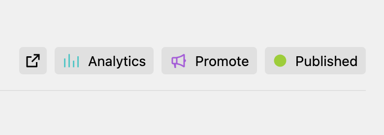
Kirby allows your plugin to add custom view buttons to most views of the Panel views (e.g. page, site, file, user, language). These buttons can be added alongside the default buttons, such as the preview button or settings dropdown button.
## Buttons in your Panel area
When you ship a custom view button as part of your plugin, you need to add them to a Panel area extension:
```php "site/plugins/your-plugin/index.php"
Kirby::plugin('custom/buttons', [
'areas' => [
'plugin-a' => function () {
return [
'buttons' => [
'analytics' => function () {
return [
'icon' => 'chart',
'text' => 'Analytics',
'dropdown' => 'my/analytics/dropdown/route'
];
}
]
];
}
]
]);
```
Buttons are defined the same way as in the `panel.viewButtons` config option, incl. available button attributes or query support.
Buttons you add via your plugin extension can then be referenced in a blueprint or the config option.
## Use a `ViewButton` class
You can either return an array with the options or a `Kirby\Panel\Ui\Buttons\ViewButton` object. Especially when working on complex buttons, it can make sense to create your custom PHP class extending the ViewButton class to power your button:
```php "site/plugins/your-plugin/index.php"
class AnalyticsViewButton extends Kirby\Panel\Ui\Button\ViewButton
{
// …
}
Kirby::plugin('custom/buttons', [
'areas' => [
'plugin-a' => function () {
return [
'buttons' => [
'analytics' => fn () => new AnalyticsViewButton()
]
];
}
]
]);
```
## Access objects in your closure
For some buttons, the context in which the button is displayed might be relevant. You can access relevant objects passed as arguments to the callback function:
```php "site/plugins/your-plugin/index.php"
'analytics' => fn (Kirby\Cms\Page $page) {
return new AnalyticsViewButton($page);
}
```
## Custom Vue component
By default, custom view buttons are rendered with the `` component.
If you need more interactivity or want to render a more complex UI, you can create your own Vue component:
```js "site/plugins/your-plugin/index.js"
panel.plugin("getkirby/custom-view-buttons", {
viewButtons: {
applause: {
props: {
praise: String
},
template: `
Applause
`,
methods: {
applause() {
alert("👏 " + this.praise);
},
},
},
},
});
```
### Use a custom component
There are different ways, how you can specify your custom Vue component to be used:
1. Kirby will use the button name from your blueprint/config to look up a potential component. For a button named `applause`, Kirby will look if a `k-applause-view-button` is available.
2. You can explicitly specify what component to use. When you use the array notation, provide it as follows
```php
return [
'component' => 'k-my-applause',
'props' => [
'praise' => 'Good job!'
]
];
```
When you are using a custom ViewButton class, the class defines the Vue component to be used.